


Black gutters, black downspouts, black windows, and bright white siding – what’s going on with this new trend?
The rapidly growing fad of black gutters, windows, etc., has taken hold, with many homeowners eager to embrace anything “new” for their houses, whether it’s truly an improvement or not. Mostly not.
Like buying a fresh wardrobe, making changes to a home can feel exciting and rewarding.
Even vinyl siding, which eliminates shadows and gives a flat, cheap appearance, is often welcomed by more simple people because it’s clean, shiny, and different.
These trends are obviously embraced without much thought.
They’re popping up not just in lower- and middle-class neighborhoods but also in more expensive, ostentatious McMansions.

A bad fad that is growing quickly.
The truth is, most homes—no matter what their size—would look far better with proper maintenance and respect for their original design. But unfortunately, clueless homeowners continue to mess with their homes spending money needlessly.
Warning to readers – this article says it straight and can be harsh to some people. If you are sensitive to this, then stop here. However, there is a strong point to be made so homeowners do not take this architectural blunder lightly.
I do not recommend this, BUT if you’re drawn to the new black gutter look, this guide will help you implement it in a way that does not break the architecture and allows this architecture to speak freely to our senses. I will also show you alternatives to give your house that extra pop and enhance its curb appeal.
Black Gutters and Black Windows is Big Business.
Gutter manufacturers are thrilled that homeowners are switching to black gutters. Promoting a fad to make money is just business, so don’t fall victim to this scheme. The homeowner who doesn’t know any better, is attracted to this black and white sparkle like a child to a shiny penny and then just copies the guy’s house down the street. If he/she does it, then it has to be good. As with everything, if you are going to copy something be sure to do it from someone who knows what they are doing and has the necessary qualifications. Should a person take health advice from a guy down the street instead of a doctor?
Homeowners love to foolishly spend money on fads, and manufacturers love creating them. But remember that this is just a gimmick geared to the more simple minded who prefer to copy anything new.
What People Like about Black Gutters & Windows.
The first question is, what attracts people to the black-and-white look? It would have to be the sharp contrast. On a plain white house, stark contrasting black gutters seem to create an outline that frames the structure making it look sharp and neat. This contrast can make a drab house pop, bringing it to life. A homeowner realizing that something is wrong and something is missing would sometimes add shutters to a plain, boring, all-white house to give it some life. Bringing a house to life is great, but there are better and more tasteful ways to do it.

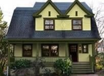
With ugly fake shutters.

Shutters removed.
The house on the left was painted all white but black shutters were added to add some punch to the house. Without that punch of black or another contrasting color, the house would look quite bland as it does on the right.
On a harsh hospital-white sided house, black gutters and downspouts show up like lint on black velvet. You don’t want people to see the lint, and you shouldn’t want people’s attention to go directly to the gutters and downspouts. Why would a homeowner want such a distraction unless they have an ugly house? When viewing a home, your eyes should be directed with a welcomed feeling to the front entrance – not its gutters or downspouts, not even the trash cans, which some trashy people keep visible from the street.
Gutters and downspouts should blend in and be part of the house’s architecture, not the focal point.
Instead of allowing black gutters to attract one’s attention, the architecture – the integration of all a building’s features and components—should work together to bring the house to life. The correct placement of paint colors can emphasize the house’s architecture – if not, it can actually “break” the architecture.
Black and White Houses Amplifies the Faults in New Home Construction.
This negative effect of incorrect color placement resulting from accenting gutters and downspouts is amplified on newly constructed houses.
Gutter manufacturers, builders, roofers, and, yes, more importantly, even architects do not understand traditional architecture. This is because universities stopped teaching Traditional Architecture during the time of WWII. Those who do understand Traditional Architecture have taken on additional studies, thereby becoming a Historic Preservation Architect. Read our article on Modern Architects & Historic Preservation.
When I say traditional architecture I do not mean constructing a building in a historic design. Methods of traditional architecture can and should be used in contemporary design which will result in a building that resonates with our inner senses .
Below is a video by Brent Hull showing the importance of window proportion.
Windows are the eyes of a house. They are the most important yet the most vulnerable features on any building. In the following example, the proportion of the wide casing makes the window appear strong and beautiful. It is designed according to the Principles of Classical Architecture.
See the following example:

This is a “real” window. Double hung, (6 over 6), True Divided Light (TDL) Life expectancy: 200+ years with maintenance.

This is a window unit. The window, the house, AND the builder are all a piece of junk. One should be embarrassed to live in a house with these windows. Life expectancy: 10-15 years. Maintenance free means cannot be maintained. Make that landfill bigger with disposable windows!
The window on the left is a “real” window. This is how a window should be designed. The window on the right is a piece of junk that people are allowing builders to put in their expensive new homes. This is what you need to understand.
First, there are two parts to a window:
- One is the casing – the frame that surrounds the window sash and holds it into place so it doesn’t fall out and hit you on the head.
- The other part of the window is the Window Sash, the part that opens.
Nice Window on the Left: The window on the left is what you see on older homes, or even those as little as 30 years old.
- Casing: This window and all windows should have a 4–5-inch wide casing.
- Muntins: The window sash on the left features wood muntins (muntins are the wooden criss-cross lines that hold the individual panes of glass in the window).Addit
- Additionally: There is a crown at the top and a sill at the base that diverts water away from the window and the house.
Ugly Window on the Right: The double window on the right is what builders use on all new cheap construction for home buyers that don’t know better or don’t care about curb appeal.
- Casings: Comparing this to the window on the left, this window is just a single unit that is merely inserted into a hole in the wall. There is no casing framing the window, as in the example on the left.
- Muntins: Unlike the window on the left, this ugly window on the right has plastic grids to fool “those people” – appearing cheap and tacky.
Unfortunately, people do not understand the difference since they are so accustomed to seeing bad design. For a better understanding of more detailed images, read our information about Windows design here.
So today, we have an epidemic of bad design spreading rapidly, fueled by untrained, unqualified professionals and a mindless homeowner desire to copy the neighbors. This lack of architectural integrity harms all homes but is especially glaring on a black-and-white house, where the stark contrast magnifies every flaw.
Check out this video by Brent Hull – “Flat Window Warning: Don’t Fall for This Dangerous New Window Look”
How to Fix Your House – First Step.
Understanding the difference between a house’s trim and its body is crucial. It is surprising how many people don’t grasp this, so don’t worry if you’re among them. I spoke to a woman with a new deck added to the rear of her house. I mentioned that it was good that the deck railing was white to match the trim and not stained. She said her trim was red. In truth, her shutters were red, and she thought that was the trim. This was a very educated person – how could she not know this? I now realize that few people understand this, and it’s my fault for assuming otherwise. I hope I can explain this clearly so there’s absolutely no confusion. Understanding the difference can make or break a house’s curb appeal.
What is the Trim on a House?
To understand what the trim on a house is, let me first explain what the body is. The body of a house is the SIDING.
Body: Siding can be clapboard, shingles, brick, and/or stone. The siding is the material that covers the exterior walls of the building.
Trim: Simply put, the trim on a house is everything that is NOT siding. The trim is composed of many wood elements such as window and door casings/framing, porch posts, railings and steps, roof eaves, soffits, GUTTERS, and so on. Again, if it does not cover the walls of the building, it is considered trim. Gutters are not a wall covering.

I created this image to show the difference between the body, trim, and window sash. Body-Red / Trim-Green / Sash-black.
How do you like these colors? I was thinking of painting my house in hope to start a circus – lol!
So basically, and for this article on black and white houses, a house will have only two colors – the body color and the trim color. Body=Red and Trim=Green or Body=White and Trim=Black.
There is a second component to painting the trim. The movable parts, such as the doors and the window sashes, while still belonging to the trim category, can be painted either the trim color OR an accent color. The window sash is the movable part of the window only, NOT the casing or the area around it. A popular window sash color for Victorian and Craftsman homes was black. Most people think this is a contemporary look, but black has been customarily used on window sashes from about 1840 through the 1930s.
I only mention this in the event one intends to have a white sash. On a black and white house, I recommend painting the window sash black, like the trim color. Having a white window is just shouting “I’m a second-rate homeowner that likes cheap plastic!” White gets a bad reputation due to all the cheap plastic used on cheap houses today.
Think of the trim as structural. The trim outlines and frames the house. As stated earlier, this trim includes gutters, soffits, facia boards, and other components. This trim, along with the color the trim is painted, determines its size. The size you see must be proportional to the rest of the house. This creates a visual structure supporting the roof, etc. If not shown correctly, the architecture will be broken.

The black gutters subtract from the white trim making the roof appear heavy.
The trim on the blue house above is painted white. Look at the trim where the roof meets the house (the eaves). This trim must show strength to support the roof. When this white gutter is painted a different color than the trim, the black subtracts from the predominant white. Part of the white trim visually disappears; it is painted out of the picture, reducing the proportion and resulting in a weak-looking eave and a heavy roof.
Takeaways:
- Black gutters are part of the trim on a house and must be treated as such. The trim must all be painted one color – no exceptions! The gutters must NOT be singled out. If you want black gutters, then all the trim must be black.
- Black trim frames and outlines a house, creating a crisp, striking appearance. But this effect—the very thing that attracts homeowners—gets ruined when sections are left out.
- When color placement is wrong, a builder’s bad design magnifies a problem that is already significant.
Trim versus Body (Siding) Mistakes and How to Fix Them.
This is where everybody messes up, making all these black-and-white houses look hideous. If you like the black-and-white look – fine – but this is what you need to do.
- DO paint all your trim black.
- DO paint your window sash black. (Hopefully, your house is not a piece of junk having those pop-in window units mentioned earlier.)
- DO paint all downspouts the color they rest against so they disappear. Downspouts are a drain and not something to be shown off. They can appear as a visual intrusion on a house. By painting them the color they rest against, they will not interfere with the flow of the architecture.
- Install window treatments – shades, blinds, curtains – or your windows will look like black holes staring at you.

Before: Black gutters, black window sashes, This trim is black in some areas and white in others. The continuity has failed and the architecture is broken.

Corrected: White house with all-black trim. House is now in balance allowing the architecture to work.
Uneducated Builders Produce Ugly Homes.
As stated earlier, the ruination of the black-and-white fad is intensified by bad design and construction short-cuts.
The example below shows a large garage. This garage also has living quarters that are less important, attached to it. This style is known as a Snout House. This design is widely known for its extreme ugliness, and construction of Snout Houses are prohibited in many areas. On these houses the garage is the main feature. The prominence of a garage gives the appearance of an animal’s snout. More on this in another article.
Below we begin with a poorly designed Snout House. This house has a haphazard use of black, which adds to the mess.
The roof, gutters, doors, and some but not all trim are in black!
How can anyone accept this as their home? Is there no pride of ownership?
A house is a reflection of its residents, and with such bad design, you’d half expect Elly May Clampett to live there.
Enter the Clampetts! The Clampett family was the quintessential “hillbillies” in the TV series The Beverly Hillbillies (1962–1971). However, the house they lived in was a beautiful well-designed mansion. Even so, If someone calls you Elly May, they are saying you do not fit in with the suitable neighbors.

Residents that fit the look of a white house with black gutters.
Below you will see a series of renderings I produced showing some corrections I made. Please understand that the final result is by no means an acceptable design. I’m just trying to smooth it over and help readers understand how they can correct builder’s atrocities. I recommend a really good book that takes badly designed homes, and drastically changes the design of a house with before and after photos, and an explanation of what and why. The book is “What Not to Build” .

#1) We begin with randomly placed black and white trim, cheap white plastic windows, a black garage door that adds importance to the garage of this snout house, and high-pants stonework.

#2) Trim is corrected, making it all one color creating balance and correcting the architecture of a still very ugly house.

#3) The garage door is painted white to match the body color to divert one’s attention from the garage.

#4) High-pants stone is removed from the garage. This is a bad location to install stone.
High-pants stonework is another fad and on my list to write an article. All this stonework at the base of a house is just awful. Architects and builders today add extra “frills” such as stonework etc. to amuse and distract the viewer so not to recognize weakness’ in the architecture. The addition of stone is not prettying up the foundation. A foundation is recessed from the siding and therefore plays a secondary role to the facade. Here the stone competes with the siding.
Adding a sort of stone wainscot like this to the house brings the ground up higher and brings down the height of the first floor. It gives one the feeling of pants being pulled up high. In this picture above the stonework at the garage interrupts the flow. The trim is also cut off in favor of the stone. Notice the difference! Now the house is grounded.

#5) White windows are shouting cheap plastic. Here they are painted black.
For a better understanding of parts of a window and what gets painted what color see this article “Painting Windows & Color Placement” .
Here is another article about “White Windows and Colors to Avoid” .

#6) A black or any dark window sash can look like a black hole without having window treatments. A light-colored window treatment lights up the black sash from behind and really makes the windows pop. Painting the front door a contrasting color will make a house more welcoming since one’s attention can now easily go to the door.

#7) Replace those ugly windows with “real” windows.
I went into detail on this earlier. The windows on this house were designed wrong. A window pane should never be square. They should be rectangular and be based on the “golden ratio” for the best most pleasing look. Read about the Golden Ratio and what makes a house pleasing to out inner senses . Instead of four-over-four, I installed six-over-six double-hung windows with wood muntins (TDL-True Divided Light).

#8) Nothing can be done about a Snout House’s prominent garage door. Since the garage is the focal point, a real wood door will make some improvement. A wood door has crisp edges – never use a non-wood door.

#10) The white siding is very harsh, so why not try a slightly darker color like taupe? Just remember that the color must work with the stone. If the stone is gray, it is a cool color. To work, the body must also be a cool color. As for white, avoid the white plastic white and try a white color with some depth. Try Benjamin Moore Navajo White.

Compare the before and after and see what you think.
The house below is another example of a bad homeowner. The trailer trash plastic shutters are a poor way to create the black & white style. The shutters are cheap plastic – probably not much different than the homeowner, and the shutters are sized incorrectly. Removing the plastic shutters and painting the trim correctly can result in the desired appearance.

Avoid the trailer trash shutters at all cost!
A Bland House Improved?
The following photos were shown earlier in this article. Here, I will go into more detail.
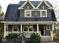
With ugly fake shutters.
Shutters removed.
The point I made earlier is that, before this black-and-white fad, homeowners would install shutters in an attempt to get that extra pop on an otherwise bland white house. This 1915 Edwardian Home is designed perfectly so it doesn’t suffer from the issues I discussed.
The problem with this house is that during the early 1900s, shutters were not used on most Victorian, Craftsman Bungalows, Foursquares, etc. Shutters were used only on Colonial Revival homes. Therefore this house never had nor should it ever have shutters.
A much bigger problem is that these shutters are cheap fake shutters. They are sized incorrectly and mounted to the windows incorrectly. It is one-hundred times better to not have any shutters than these cheap tacky plastic shutters. Learn more about shutters and see the difference.
I’m not done here yet. What this house should have and all houses built during this time with the exception of Colonial Revivals is a dark window sash. Window sashes were dark green, black, dark red, brown and sometimes other dark colors. Think of eye liner on a woman’s eyes.

Window sashes AND storm windows are painted black.
As stated earlier, you must understand the difference between the window sash (the movable part) and the framing holding in the window sash. ONLY the sash and the storm window get painted. Here is an article about painting your window sash correctly.

Window sash and all trim is painted black.
This house is painted correctly but it doesn’t do anything for the house except show that the homeowner wants to follow a bad fad.

Tan body, Dark green trim, Deep red window sash.
The above color combination is my recommendation. You still have the contrast that makes this house pop. The colors are warm and friendly, not cold and stark like a black-and-white house. The colors on this house are also period correct.
So, the bottom line is that almost all new construction today is a disgrace. Shame on builders and homeowners for buying these homes. Homeowners have come to accept poor design and seem not to be embarrassed by living in these homes. Following this new fad of black gutters on a white house is just ridiculous. I hope my explanation is easy to follow. Understanding color placement can lessen the negative impact of such bad design on new construction.
This John Ruskin’s advise to home-builders:
“Therefore, when we build, let us think that we build forever. Let it not be for present delight, nor for present use alone; let it be such work as our descendants will thank us for, and let us think, as we lay stone on stone, that a time is to come when those stones will be held sacred because our hands have touched them, and that men will say as they look upon the labor and wrought substance of them, “See! this our fathers did for us.” For, indeed, the greatest glory of a building is not in its stones, or in its gold. Its glory is in its Age.” – John Ruskin, The Seven Lamps of Architecture – 1849.
Old homes were built to be proud of but ignorant homeowners and contractors are destroying these great old homes and turning them into something they were never meant to be. If you have an older home untouched by a previous rabid homeowner, you don’t have to worry about bad architecture. You must however still follow this color placement information to allow your house toare shine.
Again I DO NOT recommend this Black & White look but if you do like it, then go for it – but do it the right way. You know how to do it right now. Just don’t copy the look of some dopy guy down the street that copied another dopes house. A style that starts as a visual trend can become a standard — not because it’s good, but because it gets copied. In the end, people forget what style, function, or beauty really means — they just repeat what they’ve seen.
Remember that a Colonial Revival house should never have black trim. There are so many color options why take the easy way out and settle for black and white? Take a look at some color options in my portfolio here .
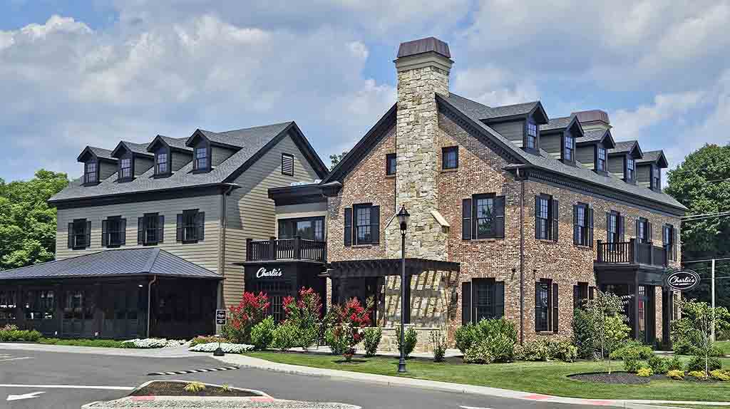
Perfect contrast shows elegance to this reataurant.
Old House Guy is a beacon of sanity in a world of weird!!
I always learn something from you. As a Commissioner on the New Britain Historic Commission here in Connecticut, I can never have enough ammo in my tool belt. So thank you again for articulating things in a way that I can convey to homeowners that come to our commission for guidance to avoid ugly home syndrome. Sometimes its difficult to convey why we do things to our historic homes to maintain the continuity of architecture of homes with respect historic neighborhoods. Especially when they were not informed they were sold an historic home by uniformed realtors
-Kenny Adams
ps i already subscribe
Thank you so much – I really appreciate your comment!
There are so many new homes being built in my area with the whole overdone “farmhouse” look. They are all dreadful, it’s like a plague in our town. I’m glad to see I’m not alone in seeing the atrocity of these houses.
Simpletons, trashy people, clueless homeowners. These harsh labels should probably stay in your own head as it comes across that you are judgemental and smarter, better than others. I was saddened with the lack of kindness this article displayed. Nothing woke, just trying to be a better human every day by showing grace towards others.
Yes, they are harsh. I have to use these words to make a powerful point. Using a more passive approach, like “not recommended,” will have less chance of getting homeowners to fix their mistakes. I also mention that trashy people keep trash cans visible from the street. This is a very bad trait in a person, and I would turn down this homeowner if they requested assistance with their house. If they don’t care about something so obvious as this, there is no hope for them.
This is a fantastic article and thank you for putting it together. I live in a farmhouse with a long wrap-around porch (over 50 feet), all painted white. It has those unfortunate plastic “trailer trash” shutters you mentioned, and we’re about to get a new roof. Our roofer suggested black gutters, which I initially liked, but your insights really opened my eyes.
We’ve got a mix of 40-year-old windows and so-called “maintenance-free” components — but they all still require maintenance. Your breakdown of trim vs. siding, window sash details, and especially the psychology behind black gutters was incredibly helpful. Lots to think about here before we make any choices. Thanks again for the depth and honesty.