Exterior Paint Color Portfolio
The following is a small sample of the over 1600 projects. Click on the image to make it larger. I do not have a listing of the colors used in the projects below so there is a research fee. If you are interested in obtaining the color name and code for any of the samples, please email me with the Project ID listed below the project name along with Before, After, Alternate 1,2 etc. Please understand that the color calibration of your monitor affects the colors you see on your screen. There is a $20 research fee for the first color and $10 for each additional color payable through Pay Pal.
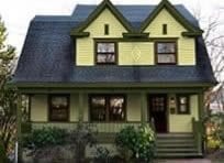
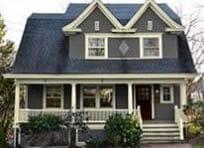
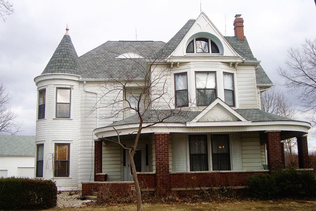
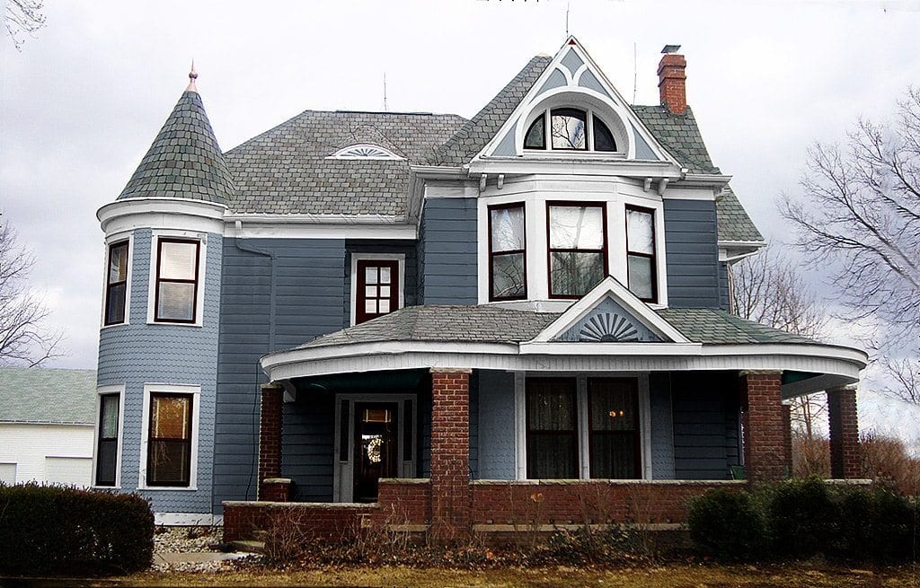
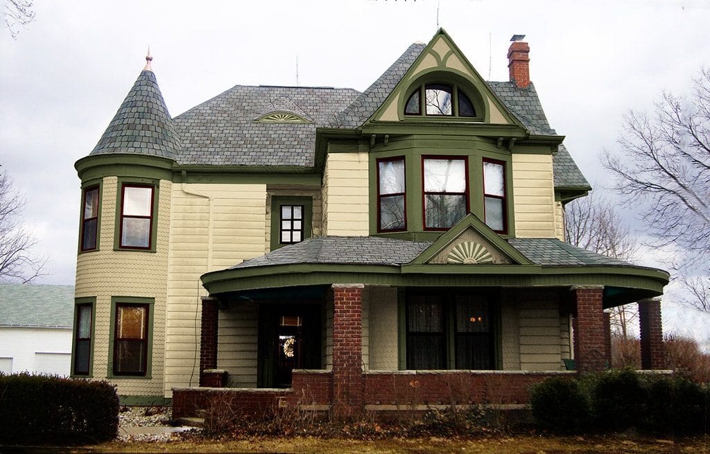
Paint Colors for Aluminum Sided 1901 Queen Ann
Scope of work:
- Exterior paint colors.
- Create faux frieze board.
Exterior paint colors were chosen by client. I tried to encourage more of a period paint color scheme however they have a barn and a few out-buildings that are bright white so they wanted to keep the white trim for a more cohesive look – at least for now. Not a good choice.
The homeowners are in the process of restoring this house. The entire house was covered in aluminum siding and has been removed in certain areas such as the turret and gables. Their ambitions paid off for as you can see they found some great surprises under the covering in the gables. Due to other priorities, they are planning to paint the house before all the aluminum siding is removed.
Look at the turret above the second floor windows. Under the built-in gutter is the frieze board which provides the appearance of a strong bold transition to the roof. This frieze board would normally continue around the house however it is covered with aluminum siding. I therefore painted the top portion of the aluminum siding the trim color to provide the look of a frieze board. This is an important feature on a house this size. Compare the difference.
Once all the aluminum siding is removed, I’m sure more detailing will be exposed that can be picked out in a future color scheme.
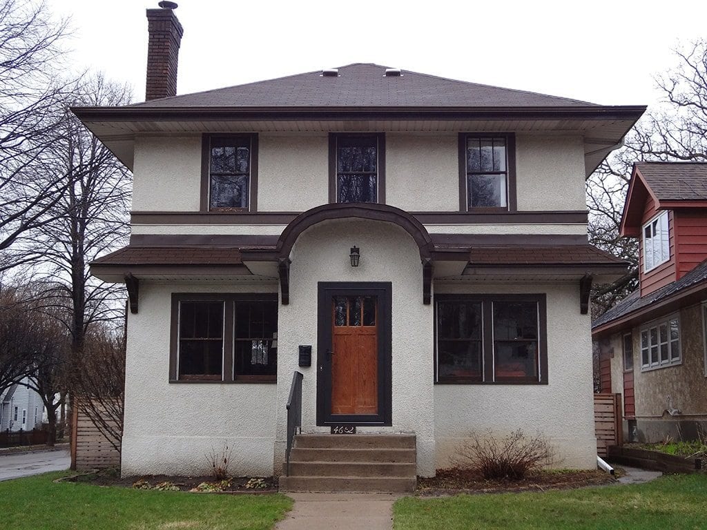
Prairie Style House Needs New Colors
Notice how the first floor roof seems to crowd the second floor. There is a piece of flashing above the roof that is brown. In the after picture that flashing is painted the body color for a better look.
Scope of Work:
- Exterior paint colors and color placement correction.
Suggestions for future improvement:
- Remove storm door and landscaping.
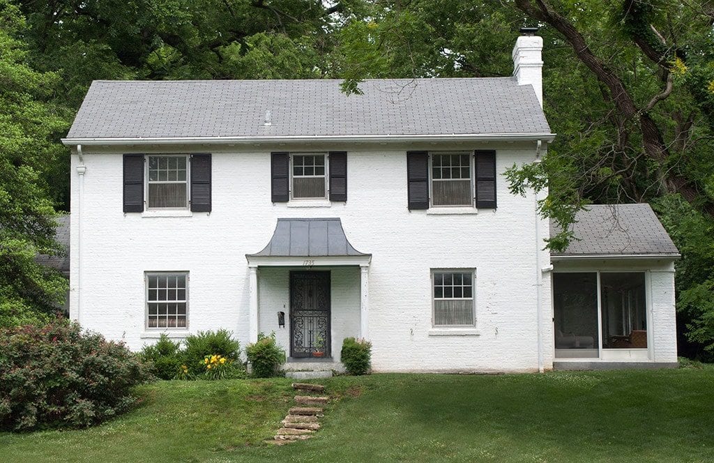
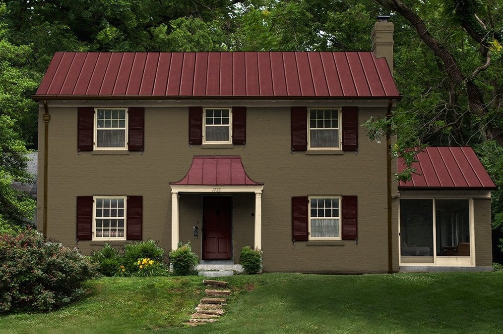
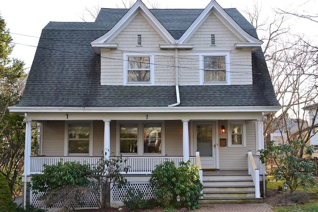
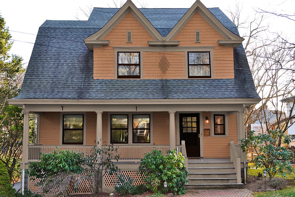
1908 Dutch Colonial gets New Paint Colors
Scope of Work:
- Exterior paint colors and correct color placement.
- Construct new vents in gables.
- Remove storm door to make entrance welcoming.
- Remove gutter front center. Water will drain to roof below.
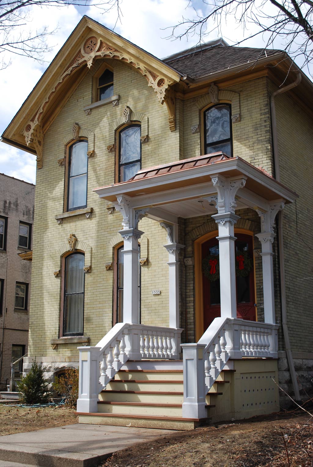
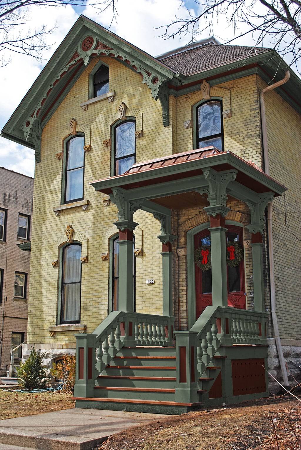
1876 Italianate with Yellow Brick
Dark colors were most popular during this period. A black window sash with dark green trim helps bring out the depth of the yellow brick.
Scope of Work:
- Exterior paint colors and correct color placement.


