


Exterior Paint Color Portfolio
The following is a small sample of the over 1600 projects. Click on the image to make it larger. I do not have a listing of the colors used in the projects below so there is a research fee. If you are interested in obtaining the color name and code for any of the samples, please email me with the Project ID listed below the project name along with Before, After, Alternate 1,2 etc. Please understand that the color calibration of your monitor affects the colors you see on your screen. There is a $20 research fee for the first color and $10 for each additional color payable through Pay Pal.
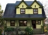
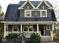
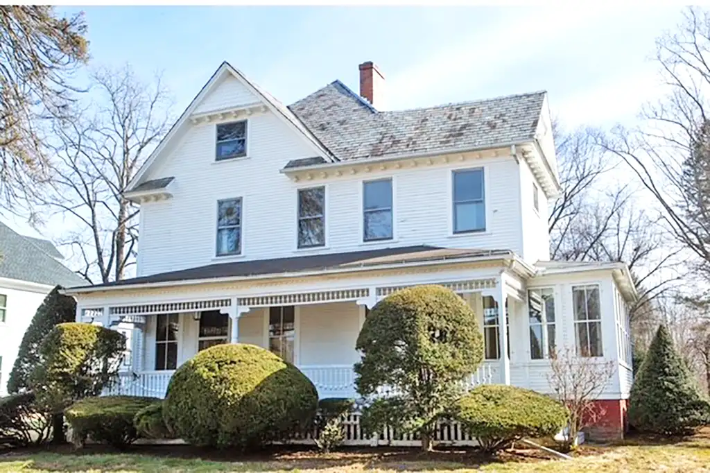
1900 CT Victorian
Before
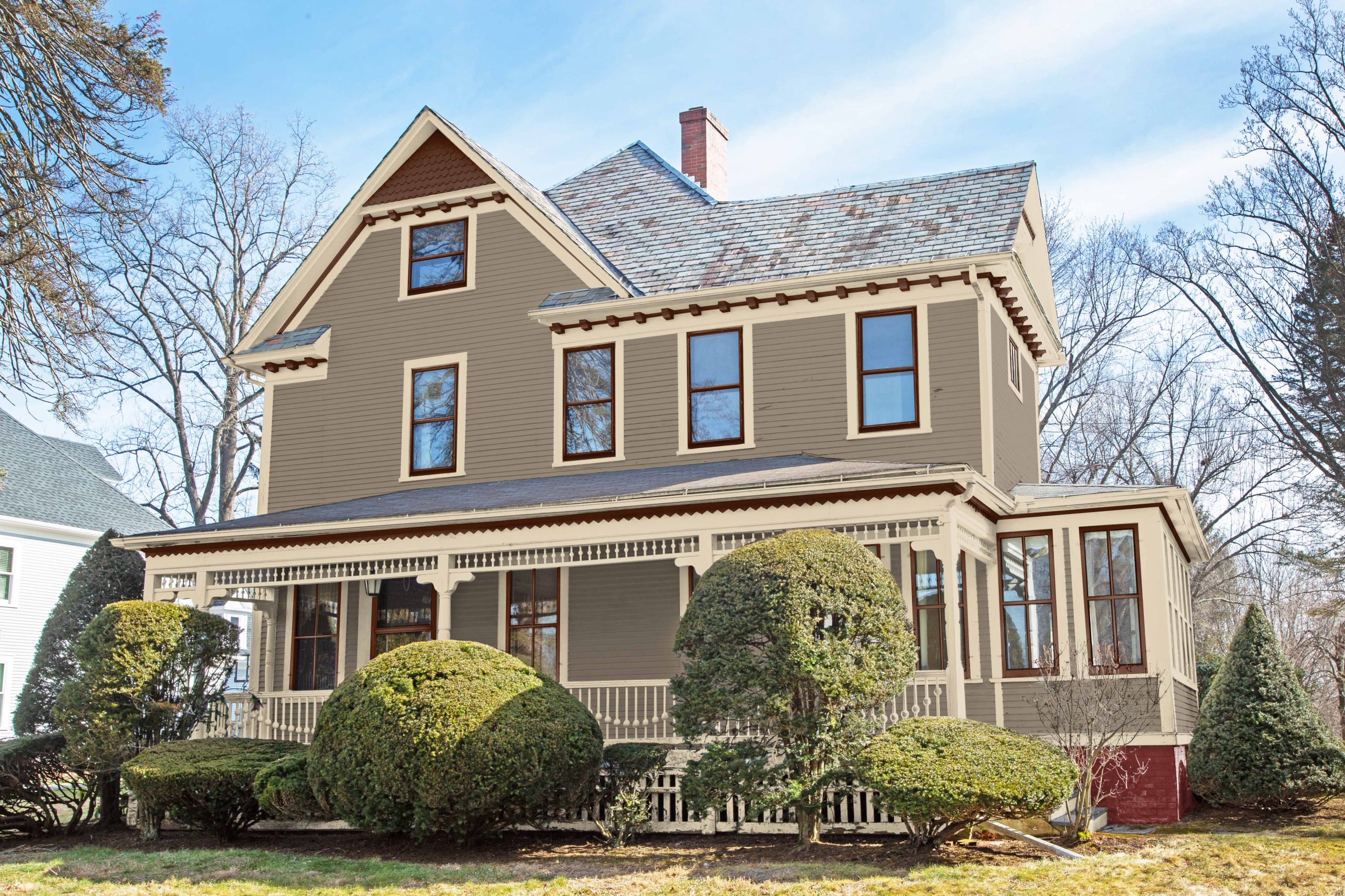
After Rendering.
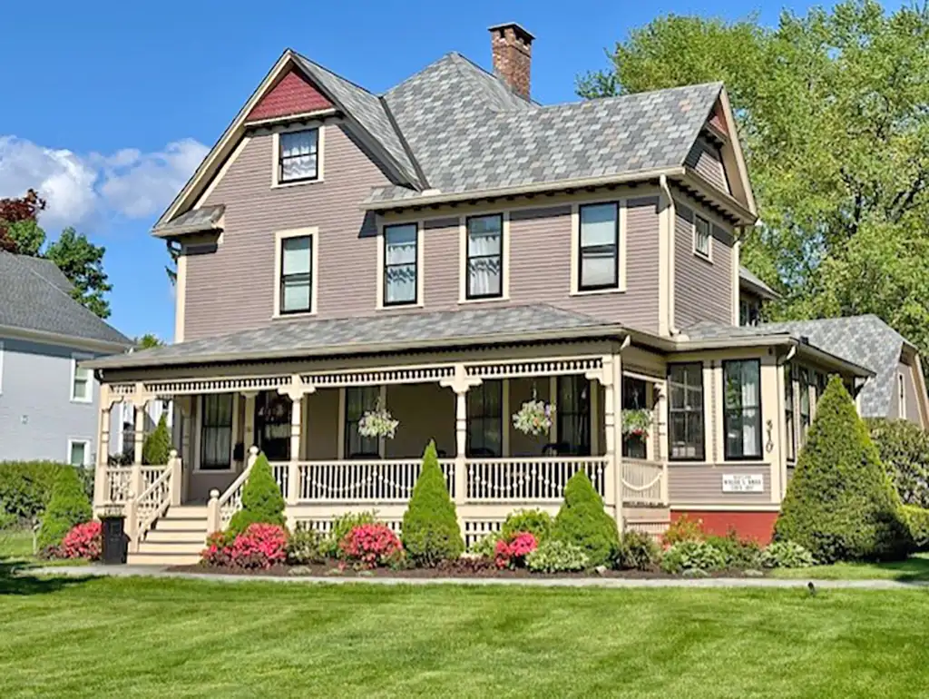
Actual after photo.
As of 2026 I have worked on over 1,600 homes and it is impossible to post every home on my website. I worked on this house back in 2020 and the painting and landscape was just recently completed. The homeowner sent a photo of the completed house painting and landscaping. Above, the after image is my rendering. The next alternate photo is an actual photograph of the result. This is proof that a house with well done landscaping both work together. You can’t have one without the other.
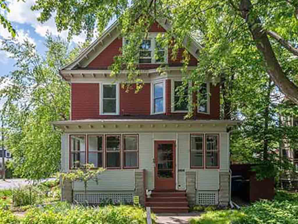
1914 Edwardian in MN Opens Porch
Before.
Actual after photograph.
Curb appeal is IMPOSSIBLE with an enclosed porch, therefore a porch must first be opened up before new colors can be chosen. An enclosed porch disfigures the architecture of a house. Thankfully this house was owned by homeowners who really care about their house. One would barely recognize the final house from the before photo. This is not a rendering.
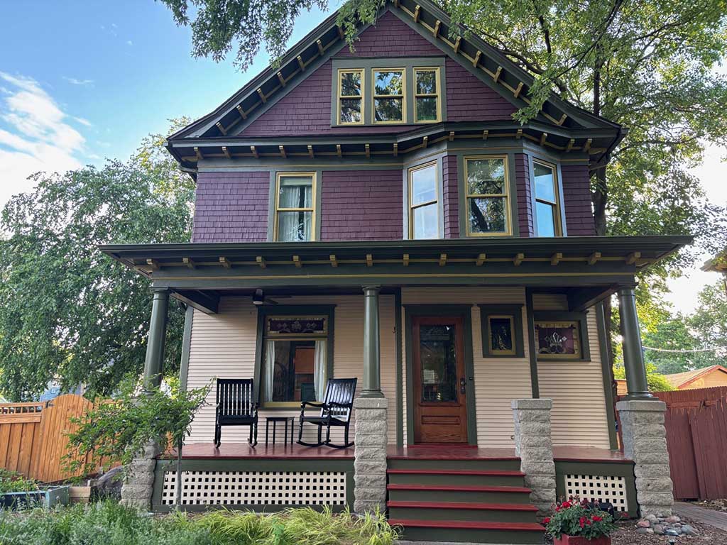
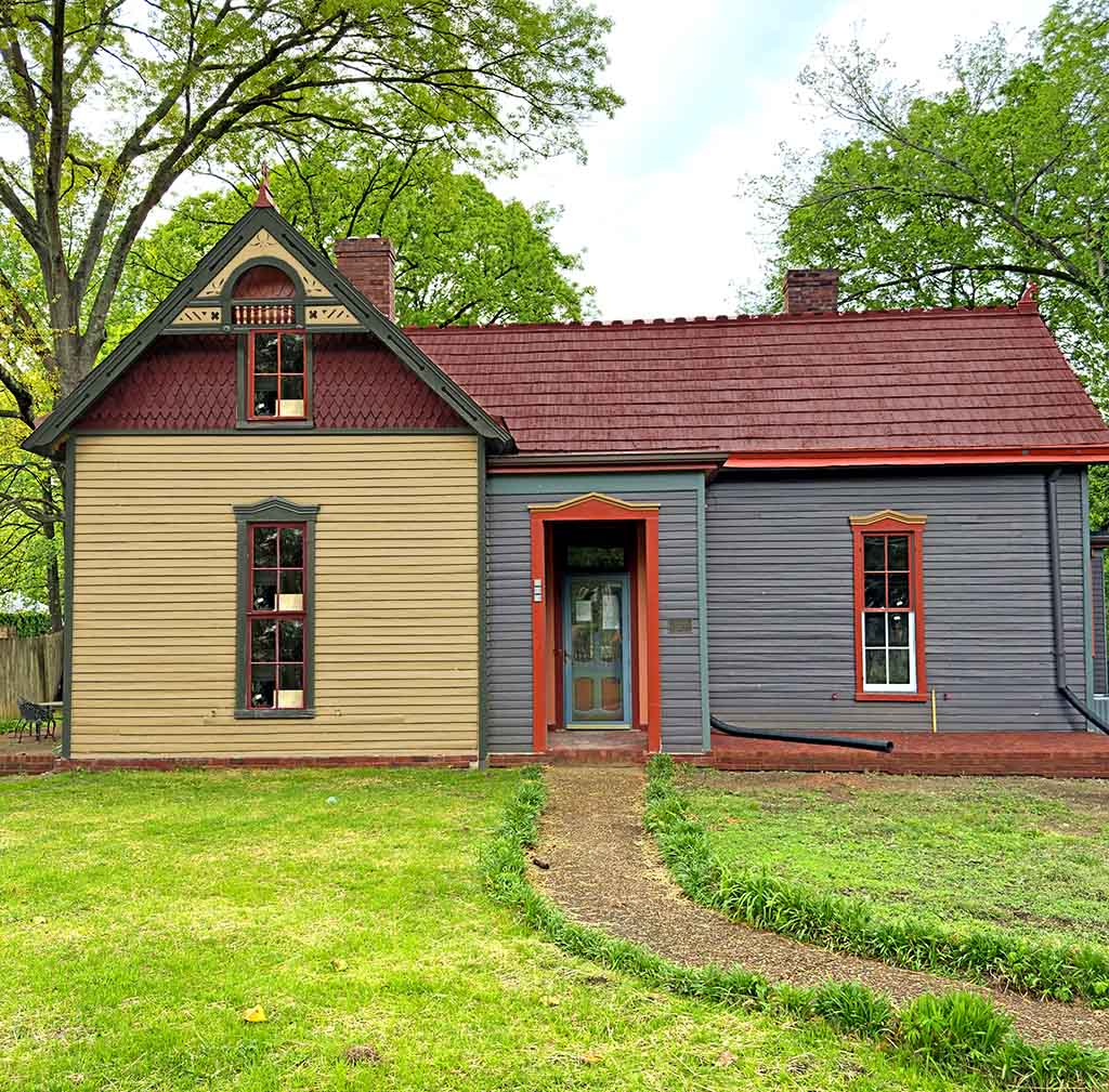
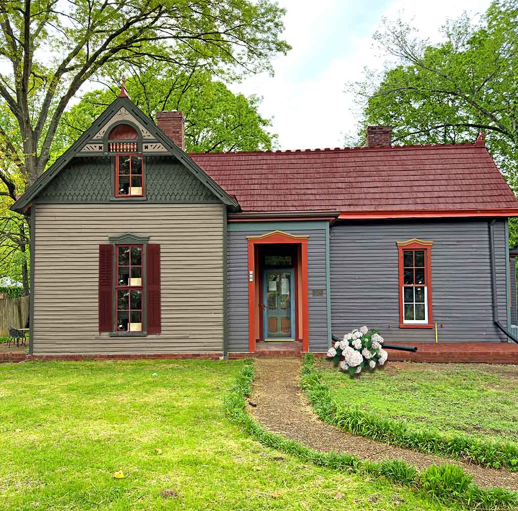
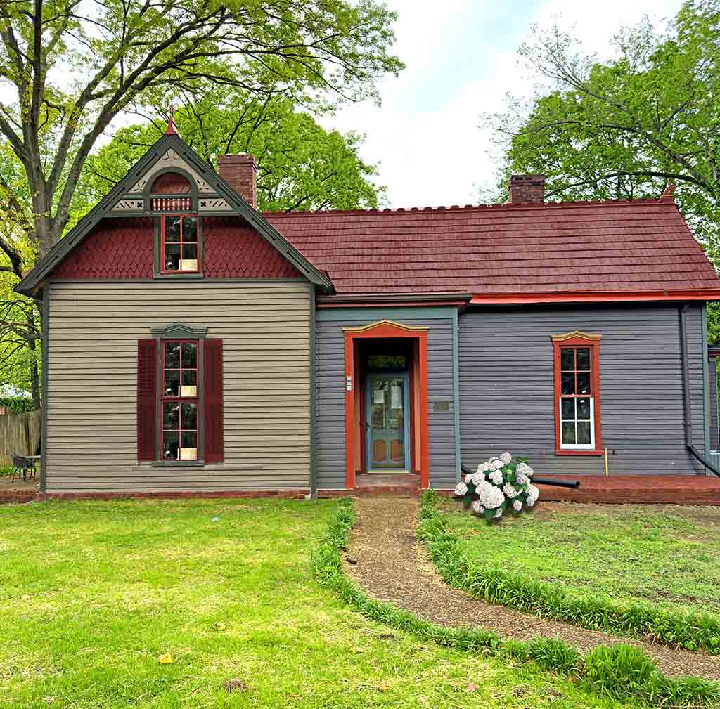
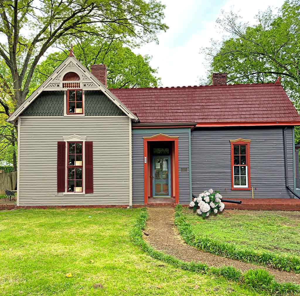
1893 Small Eastlake Victorian in TN.
Before.
After.
Alternate.
Alternate 2.
Alternate 3.
Once again, color placement is a problem. A lovely house but not super fancy. The alternating paint colors in the gable are over-done and make the house feel off balance since the viewer’s eyes go directly to all the colors in the gable. The rest of the house is not noticed.
A vent replaced a window in the gable. While a vent is good, it is too large. The window needs to be replaced so I pasted one in there. The rendering with the gold body is missing the shutters. I forgot to add them.
1890 California Victorian
After.
This is a partial rendering via a Zoom consultation. The door has not been corrected. The big problem was the color placement on this house and that it had four trim color which I changed to one.
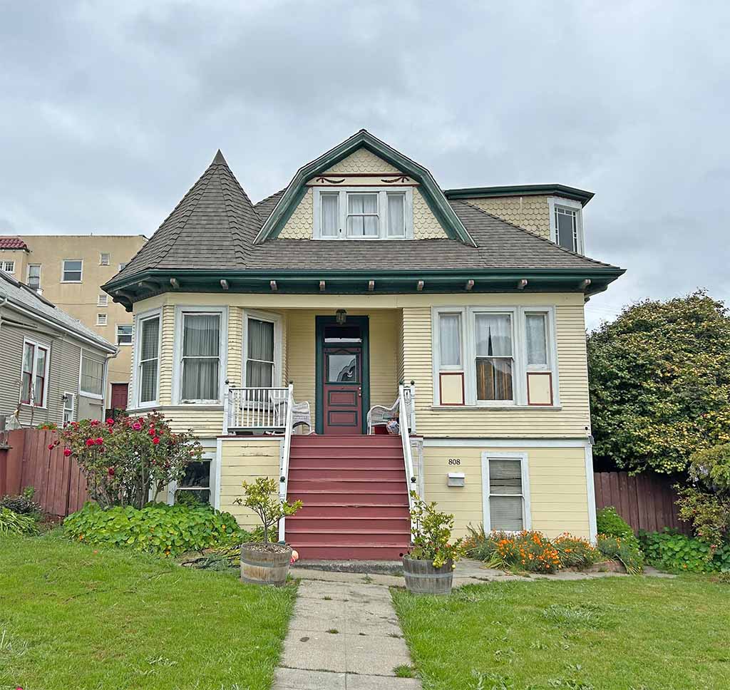
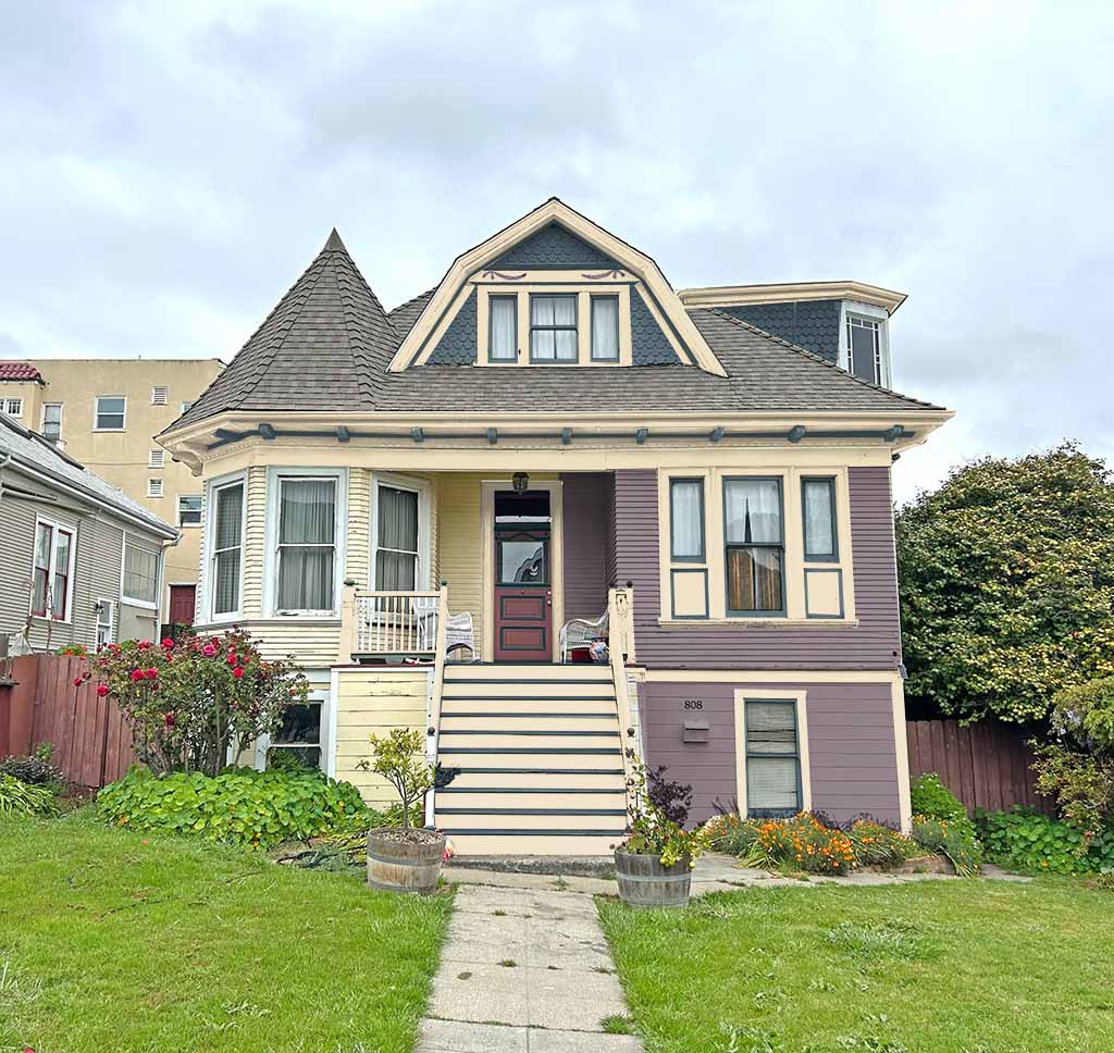
1923 Bungalow in WA

Before.

After - homeowner selection.

Alternative.
One thing to keep in mind is that your roof is very important. The dormer is the prominent feature, and by not having too much contrast the dormer does not stand out too much which can make it appear that it doesn’t belong. The before image worked well but the colors were not correct for the period. The roof is also a cool color so warm period color would clash with the roof.
Also notice that the alternative image does not work with the roof. The roof is gray – a cool color. The trim is cream which is a warm color that fights with the gray roof. I great combination but for a house with a warmer roof color. Read about roof colors.