


Brick or stone halfway up the façade of a house is a common feature seen in all new construction and renovations today.
This trend is not new but originated in Mid-century homes.
If you look at many mid-century houses , you will notice a common feature: brick or stone covering the lower third — and sometimes nearly half — of the façade.
This was not a long-standing architectural tradition. It was a mid-20th-century development driven largely by economics, marketing, and federal lending policy — not by architectural design principles.

The History of Brick & Stone use Combined with Wood Siding.
Before this period, material use was straightforward. Masonry houses were masonry. Wood-framed houses were wood. You did not see a decorative band of brick halfway up a clapboard house.
What changed was the rise of brick veneer construction. By the 1930s, advances in platform wood framing, cavity wall construction, metal brick ties, and asphalt building paper made it possible to apply brick as a non-structural veneer over wood framing. The wood structure carried the load, while the brick became an anchored outer skin separated by an air gap for moisture control. Once masonry no longer had to be structural, it became decorative — and builders could use it selectively for appearance rather than necessity. This created the appearance of permanence without the cost of full masonry construction.
At the same time, the Federal Housing Administration’s underwriting standards promoted materials that were associated with durability. Brick symbolized permanence and higher resale value. Builders discovered they could satisfy both buyer expectations and lending preferences by placing brick only on the front elevation — and often only partway up.
The Ranch house popularized this further. Designers used a modest masonry base to visually “ground” long, low façades. When restrained, it worked. The stone base acted as a horizontal anchor beneath the siding.

But in post WWII mass production housing, that restraint disappeared.
As the masonry rose from one-quarter height to one-third — and eventually to nearly one-half — the proportions changed.
Traditional façade composition depends on hierarchy: base, wall, and cornice. When the base becomes too tall:
- Windows appear visually lowered.
- The upper wall is compressed.
- The cornice loses breathing room.
- The house reads as top-heavy.
Instead of grounding the structure, the masonry begins to squeeze it.
This is why so many of these houses feel awkward. The proportions have been altered.
Today, this trend has returned. Stone veneer is marketed as “luxury” and “curb appeal.” But again, when applied too high on a house that was designed as a fully sided composition, it disrupts the original balance.
Brick or stone should either be structural and full-height — or used sparingly and proportionately.
When it climbs too high, it no longer strengthens the architecture. It distorts it.
Brick/Stone versus All Wood.
Below are renderings showing homes from the 1950 and current new construction that have brick or stone. Even though this is a historic feature used on Mid-century Modern Ranch houses, you can see that this is still bad architecture. Any use of brick or stone in this way will destroy the proportion which in turn makes a house feel unpleasing to our senses – new or historic.
I am not saying that these Mid-century houses should be renovated removing this masonry, just that this was bad architecture. Bad as it was, this was a character defining feature of a now historic Mid-century Modern style and should not be changed. New construction is another story. Click to enlarge.

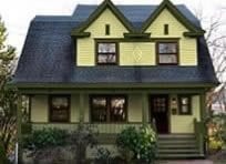
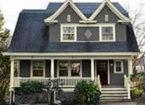
Brick pulled up to the window sills divides the house into two halves.

This rendering shows the brick removed. The house now looks like it can breathe. Shrubs will soften the facade.

Brick appears to swallow up this house.

Not a great looking house to begin with but an improvement.

This is a sin! The architecture has been ruined by making this house into something it was never meant to be.

Bungalow as it should look.
This doesn’t say much for the owners of this house.

This is how the house should look.

Stone should not be added to a house just because it could be. One must remember that less is always more.

I removed the brick but left it on the foundation and entrance. The problem with adding it to the foundation is that it is proud of the siding, and water will run down the siding onto the stone rather than drip away onto the ground with a foundation that is recessed.

An ugly black-and-white house, made uglier by stonework.

Removing the stone at the base makes the house appear larger and more grounded instead of sitting on a platform.

Ignore the tacky landscaping and the two large out-of-place windows. This house has a foundation and a brick wainscoting. It all looks ridiculous!

I painted the foundation a darker gray, which matches the roof, and does not stand out like the white. Still an unappealing house.

This stone foundation looks like a barricade or is the house sittling on a platform. Do people really like this?

A clapboard house can have a visible foundation or siding to the bottom. I left it at the base here. This is acceptable, but would look better without any stone. Additionally, while the main house may have a visible foundation, the garage, as shown to the right, would not as in the image below. Again, the stone should be recessed and not proud of the siding.

Stone below the porch is acceptable but not on a garage.

See how your attention is drawn to the porch and entrance by removing the stone on the garage. The design appears cleaner.

This house looks like it is going to be moved across this stone platform. For new construction, it’s not a bad-looking house. Why ruin it?

Without the stone, this house appears grounded now and more pleasing to the eye. As with all these simple planting will soften the front of a house.

This is a clients house. The brick at the base serves no purpose other than to distract the viewer.

Besides new colors, the only way to easily fix the problem was to paint the brick to match the siding.
New Construction May Require Brick or Stone.
In many communities, brick or stone covering a large portion of the façade is not even a homeowner’s design decision — it is required by ordinance. Municipal codes often mandate a fixed percentage of masonry on the front of a house.
The problem is that these rules regulate quantity, not proportion. The people that set these rules have no understanding of design, but only show their lack of taste and knowledge.
A percentage of stone or brick requirement from 20-80% does not ensure good architecture. It does not address scale, hierarchy, or whether the house was ever meant to be masonry at all. It simply assumes that more brick or stone equals better design.
When materials are dictated by formula rather than proportion, the result is often façades that meet the code — but lose their balance and beauty.
Conclusion.
Architecture is not improved by adding more materials. It is improved by respecting proportion.
Brick or stone halfway up a house was never a historic tradition. It was a mid-century cost-saving compromise that slowly became normalized. When masonry rises too high on a façade that was designed to be fully sided, the proportions are altered. Windows feel shorter. The wall is compressed. The house loses its natural hierarchy.
A base should ground a house — not dominate it.
Good architecture depends on balance and restraint. Once those are lost, no amount of “stone accent” will restore what proportion once provided.


Excellent analysis, Ken! Hopefully this visual evidence will influence future builder designs!
Thanks!!
I enjoy all your article and pictures! The pictures make your articles more meaningful and educational. Thank you for all you do to promote good design.
Thank you!!
RE: Client house. Wish you could have talked the client out of those awful black-tinted windows. That’s another trend that ruins the looks of a house, whether new or old. Otherwise, good historical perspective on stone/brick trim.
Good point. When a house has a window sash painted a light color, they do not need curtains. I know, but some people especially out in the country do not want curtains and are not concerned about fading furniture etc. With a dark window sash you need something light behind the window to show it off. Curtains, shades, or blinds. Notice that a few windows do have shades on my client’s house and those windows looks good. Otherwise it looks like a black hole.
Hello Ken, I agree with BTB that the black out windows (which is a big trend now) are architecturally really bad, as they appear like dark holes in the facade. Also, many of these post Mid Century houses have poor graduated fenestration (this is an architectural design technique that varies window sizes across a building’s facade, typically featuring taller, larger windows on the lower floors and shorter, smaller windows on upper levels.) This method establishes a visual hierarchy, creates a “heavier” base for better proportion, and provides a timeless, balanced aesthetic commonly found in classical residential design. Also these houses have many mulled double-hung windows (these are two or more units joined side-by-side into a single, larger frame) that have shutters that obviously cannot close over the entire window, this creates a false narrative. One more point about windows, mostly on the McMansions, the windows do not step back from the siding which makes the house look flat without shadow lines and the use of fake muntin’s (or window grids) adds to the flat appearance as they are unable to create dimension and shadow lines.
If a window sash is a dark color, you really need to have curtains, shades or something behind it. Sometimes a window glare will help but not enough to give the best appearance.
After WWII, building became more of an assembly line to build quick and cheap. The windows being flush with the window casing is a huge problem. When homeowners see a window sample they don’t notice how bad it looks.