


If you’re lucky enough to own a Victorian home with its original front door, it’s essential to approach painting it with caution. Painting an elaborate door or even a more simple door can be tricky and can result in a mess if the colors and their placement are randomly placed. The goal is to enhance the details so they can be enjoyed without going overboard and creating confusion. I will show you an easy to follow, can’t lose, formula for painting.
This guide is ONLY for Victorian homes. If you own a Craftsman, Foursquare, Prairie Style, or any other style of architecture, I’ve written other articles that will help you.
- Painting Your Front Door – Applies to ALL house styles including Victorians. This article discusses the visual impact of door and trim color placement. It explains the importance and the effect of the trim and door paint color placement specifically for the entrance. Sounds simple but you will see.
- Front Door Paint Colors – This article is for ALL styles of houses. It shows color choices across different styles and when it is appropriate to use a contrasting color for the door.
- Storm Doors versus Curb Appeal – Explains why storm doors detract from you home’s appearance and how to work around them if necessary.
Does it Really Matter What Color I Paint My Front Door?
Absolutely. Color affects rhythm, balance, and the overall harmony of a façade. You can’t simply choose colors randomly and expect your home to look cohesive.
For example, Colonial and Colonial Revival homes tend to be symmetrical, with evenly spaced windows often flanked by shutters. This strong visual rhythm makes it appropriate—even necessary—for the front door to be painted a distinct separate accent color.
Victorian homes, however, are different. Their designs are typically asymmetrical, with a more dynamic and ornate appearance. Introducing a new color on the front door—one that doesn’t relate to the rest of the house—can disrupt the overall harmony. That’s why, unless the door is stained and varnished, it should usually be painted the same color as the window sashes, which are typically a dark tone.
Understanding the Color Scheme.
Victorian homes generally use a three-color system:
-
Body Color – The siding.
-
Trim Color – Everything that is not siding (e.g., cornices, soffits, eaves, brackets, window surrounds, porch columns and everything connected to the porch).
-
Accent Color – Most often used for window sashes, shutters and doors (features with moving parts and traditionally painted the same color). Other accented areas can be brackets. Best to be cautious here.
Think of it this way. Paint all your siding color A. Then paint everything that is NOT siding color B. Ok – you’re done! Now you have the option of adding a third color. If your house was built before 1930 I recommend adding an accent color. This color will first be added to the window sash. Next, this accent color can then be cautiously repeated, selectively in other architectural details to establish a sense of continuity and balance across the house.
The reason you do NOT want a contrasting front door like a Colonial Revival house would is to be able to distribute the accent color more evenly across the facade. A drastically different door color can break the flow.
Even though it may sound limiting, most Victorians should stick to these three main colors (excluding porch floor and ceiling colors). Although three colors may sound boring for a Victorian, when applied with proper placement, the result will be outstanding—often giving the illusion of more than three colors. It’s not about the color as much as it is about the placement of these colors. This runs contrary to the advice of some color consultants who lack architectural training; they may offer very appealing palettes but place colors in ways that disregard a building’s form and logic. Be cautious – their colors are great but placement can actually break the architecture.
Check out my portfolio and you will see beautifully ornate Victorians with only three main colors. There is usually a fourth color if for example clapboards and shingles separated by a piece of trim . Of course for more elaborate homes an additional color or two may be added, but you will see in my portfolio this is not usually necessary. Actually when looking at a Painted Lady of San Francisco I find it almost impossible to follow the format of paint placement even though I do love these houses.
How to Tastefully Paint an Ornate Victorian Front Door.
Now that you understand why your front door should match the sash color, what about decorative features like raised panels or applied moldings? There is a format to follow that will make your door look great!
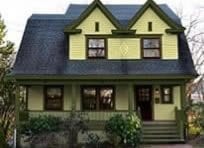
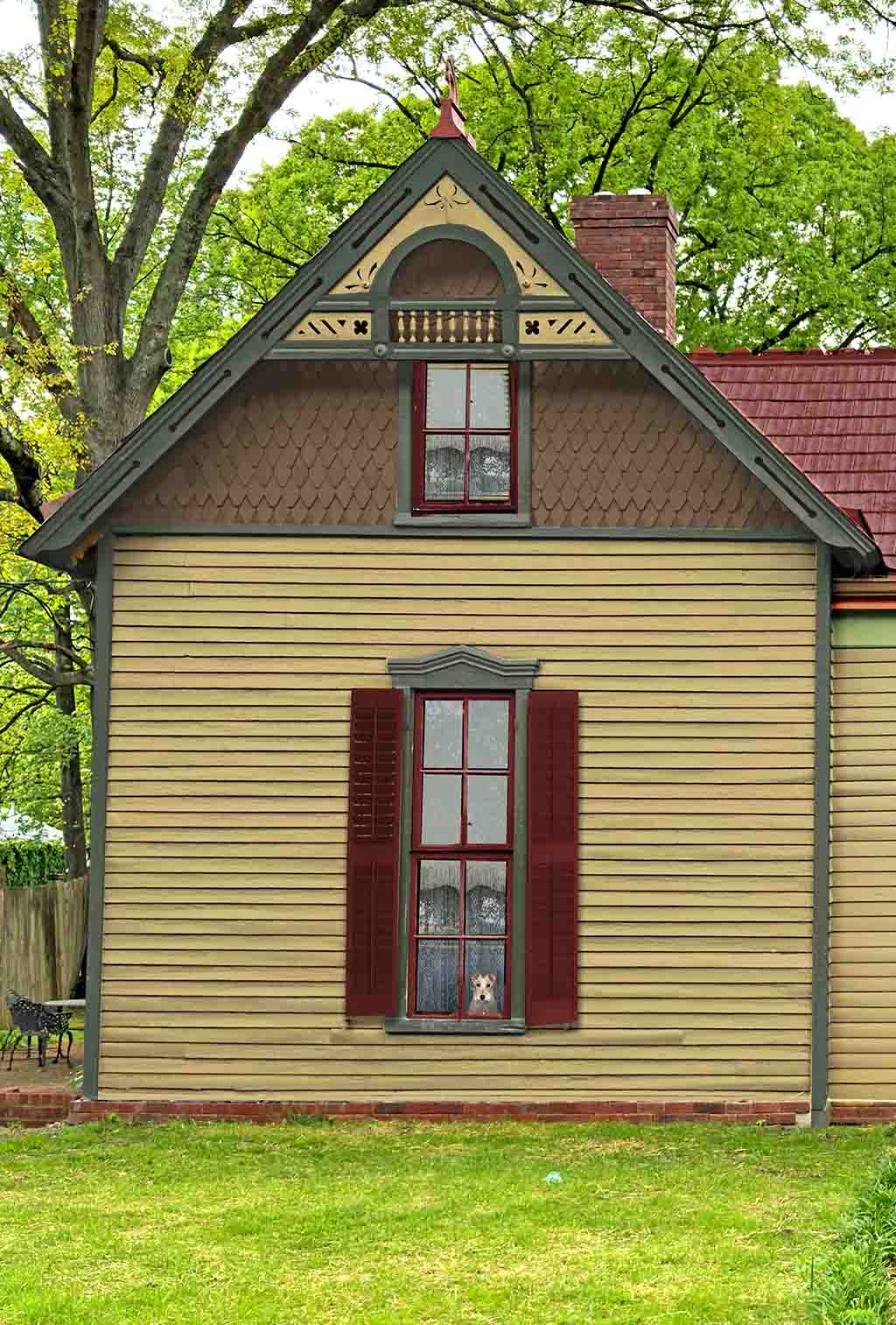
Example of a Victorian with three colors.
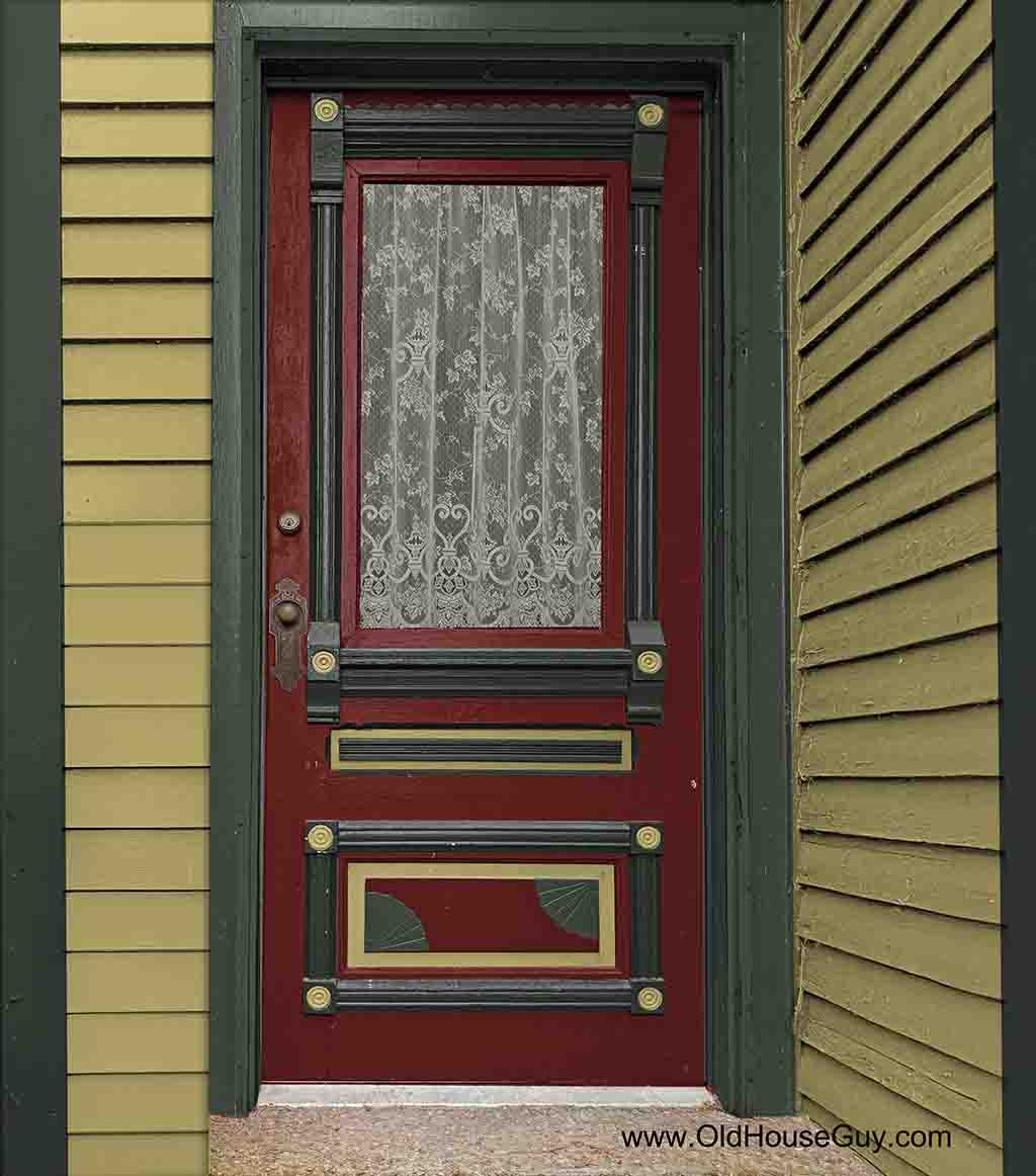
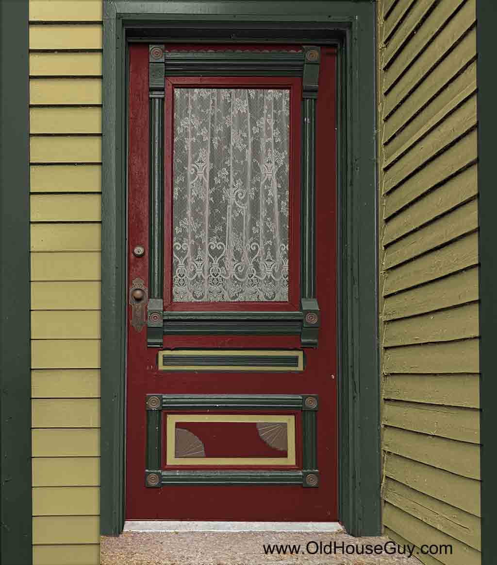
Very ornate Victorian door with three colors used on house.
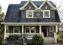
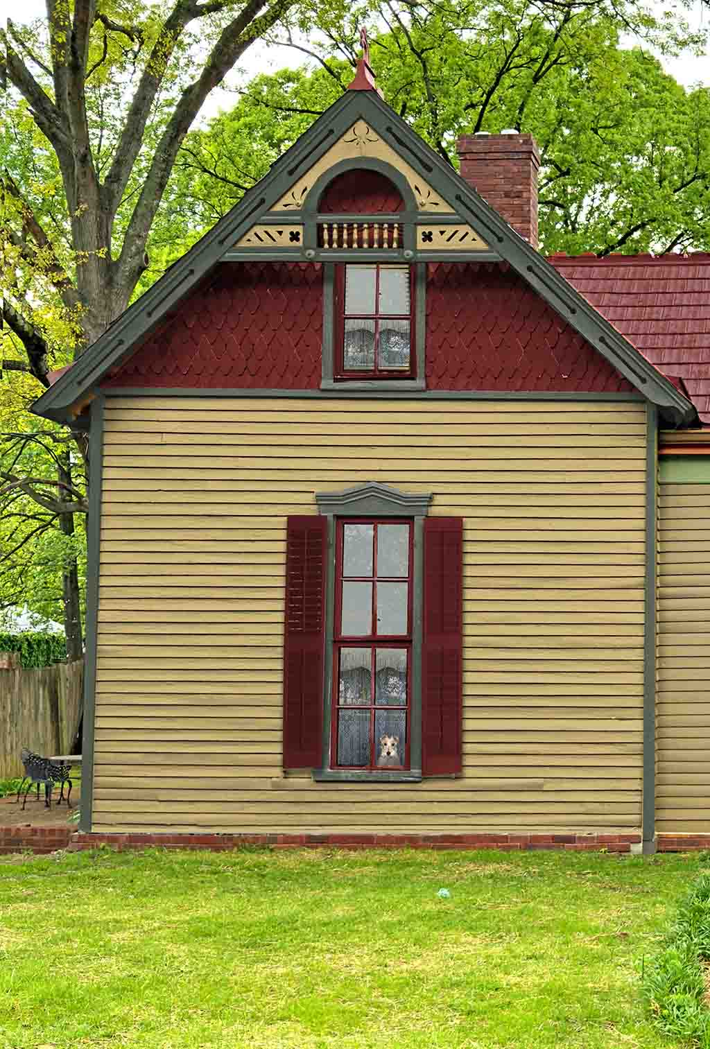
In the example above this 1893 Victorian has gold as a body color and dark green as a trim color. The accent is only placed on the window sashes and the shutters. The sash and shutter colors normally match. Here you have three colors. This house also has decorative shingles separated by a piece of trim in the gable. This means that a new color can be added although not required. In this example the accent color is reused on the shingles.
Notice the beautiful gable decoration. The recessed area is like a panel and therefore can be painted the body color in that area. Here is an article explaining panels on a house. This inset part of the gable decoration does NOT have to be accented with the body color but can be painted the trim color in its entirety. You cannot do this with a light trim. Only with a dark trim. With a trim, a darker color in this area will subtract creating a void in appearance. I will write more on this another time.
As I stated earlier, movable features (window sash, shutters, doors) are painted the sash/accent color as you see on this door.
- Paint the entire door the window sash color.
- Paint the panels (recessed areas) the body color. In this case the panel has a recessed and a raised part.
- Paint the outlining features (molding – trim) in the trim color.
- Next paint any ornaments the body color as you see in the rosettes.
There is a logic to this placement. This is a VERY ornate door and can create confusion on behalf of the painter and the viewer. I feel this placement allows the ornamentation to shine while not looking tacky.
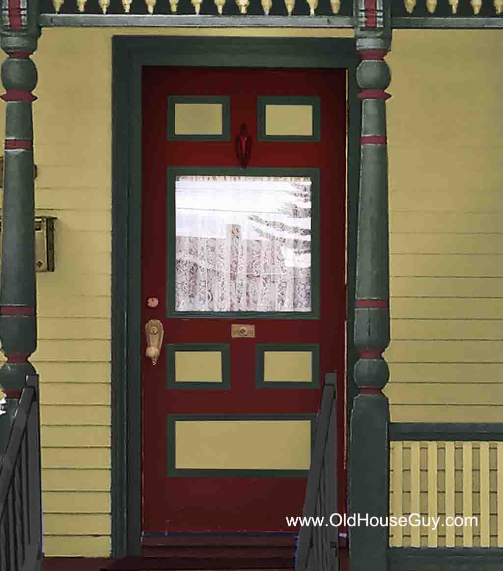
Basic Victorian door showing panels outlined with the trim color.
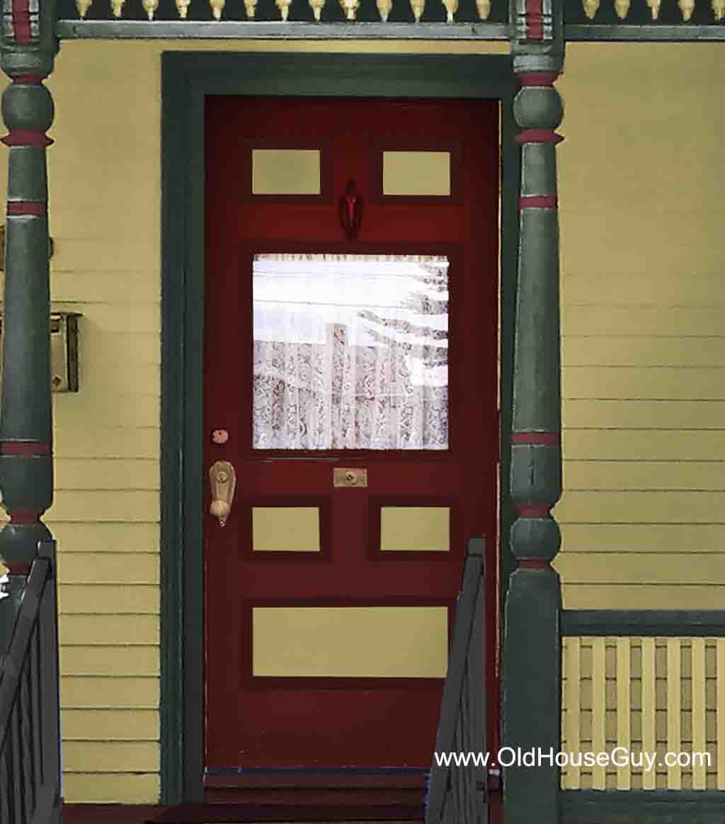
Basic Victorian door with panels outlined with the main door color. These edges can be painted either the trim or the sash color but not the body color.
The Victorian doors above are what most homes of the period have. Again the door is the window sash color and the panel is always the body color. Notice the door on the left uses the green trim color in the piece surrounding the panel. Some doors do not have this. The door on the right has this feature also but is not accented to have a more basic look for a more simple house. Understand that the flat part of the panel is the body color and not the edges.
Victorian with four house colors.
Ornate door using four colors from the house.
This example shows the same house but instead of red, the gable is brown giving the house four colors. Notice the example shows the rosettes and the fan at the bottom using this brown color.

Four color Victorian with light cream trim and darker body colors.
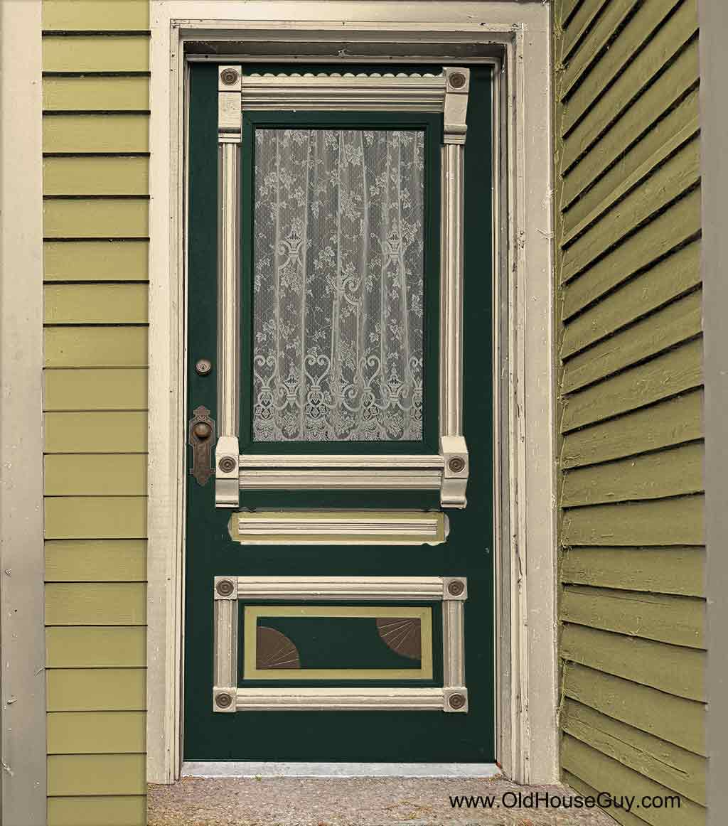
Ornate door using four house colors.
Color placement is quite different on a house with light trim. Notice the gable decoration is all the trim color. If the inset section was painted the body color, following the format in the above example with dark trim, instead of highlighting the design it can create the appearance of an empty void.
I hope all this makes sense so you can make your house look its best!


Thank you so much for the detailed explanations. Having the images makes it clearer visually and very inspiring.