


Exterior Paint Color Portfolio
The following is a small sample of the over 1600 projects. Click on the image to make it larger. I do not have a listing of the colors used in the projects below so there is a research fee. If you are interested in obtaining the color name and code for any of the samples, please email me with the Project ID listed below the project name along with Before, After, Alternate 1,2 etc. Please understand that the color calibration of your monitor affects the colors you see on your screen. There is a $20 research fee for the first color and $10 for each additional color payable through Pay Pal.
Florida Home Painting

Before

After

Alternate colors.
I really like the pinkish color. The homeowner wanted a very light gray with black window casings.
Scope of Work
- Paint colors.
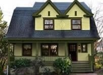
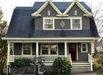
1930 Georgia Bungalow

Before

After

Alternative colors.
This nice little 1930 Bungalow sits up high. The wall in front of the steps is done in stucco to match the stucco in the gable. This is and was not a good design because a light color in the foreground stops your eyes from viewing what is behind it. One option would be to paint the stucco wall and the stucco in the gable a darker color. A better solution is to try to match the brick with a brick veneer. New real brick cannot be used because there is a limestone cap on the top and the brick is too thick to fit under it.
The window sash looks better the trim color instead of black for the homeowner does not have curtains to lighten up the window behind the dark sash.
Scope of Work
- Replace stucco with brick veneer.
- Paint colors.
1920 Ohio Home

Before

After - This is what the client chose.

Alternative paint color.

Alternative color scheme.
There is some great detailing to this house. Contrasting color will better show these details. I would recommend a bit more contrast as shown in the alternative color schemes however. The client wanted an almost black trim with a dark gray body. This still shows the detail and may look better in real life than in the image here.
Scope of Work
- New dark paint colors.
1885 Italianate Victorian in Washington

Before - notice the bad shutters.

After with period colors.

Alternative paint color. 1264

118

46

13
This beautiful 1885 Italianate should not have had shutters. Worse yet they were fake, the wrong size, and mounted wrong. For more info see https://www.oldhousguy.com/shutters . Notice in the before image there are spandrels under the porch eaves. (spandrels are like another balustrade at the top of a porch between the porch posts) This inset section was accented with a dark color. When using a white or light trim I do not use any accent coloring because with a high contrast the accent color makes the wood that is painted disappear as you can see. Using a dark colored trim there is less contrast and there is more opportunities for accenting. Additionally accenting on a white trim can result in a cheap look for it is so bold.
I know a lot of people prefer the sharpness of white trim. Just about every house has it. We are so accustomed to seeing white trim today but it reminds me of vinyl siding on a split level house. The before image does look nice but is not the right look for an Italianate home.
Scope of Work
- Remove shutters.
- New paint colors.
1912 Vernacular Victorian Wins Award for Paint Colors

Before

Award winning paint scheme.
The Chicago Paint and Coatings Association awarded this house “Best Use of a Historically Accurate Color in a Residence Professionally Painted” in 2018. This house is painted using historic colors and is very tasteful looking. The body color is interesting for depending on the lighting it can appear tan or more of an olive green. This house was built by the son of the village’s founding father who was the second mayor. The house has remained in the family for three generations and has been well preserved.
There were several contest winners in various categories. Unfortunately many of the winners were overly done and color placement was tremendously incorrect. The judges obviously had no background in architecture. Random placement of various colors may seem stunning and interesting to some but in my professional opinion this can make a beautiful house look unappealing.