


Exterior Paint Color Portfolio
The following is a small sample of the over 1600 projects. Click on the image to make it larger. I do not have a listing of the colors used in the projects below so there is a research fee. If you are interested in obtaining the color name and code for any of the samples, please email me with the Project ID listed below the project name along with Before, After, Alternate 1,2 etc. Please understand that the color calibration of your monitor affects the colors you see on your screen. There is a $20 research fee for the first color and $10 for each additional color payable through Pay Pal.
1940 House in Vermont

Before

After.
Alternate colors.
This house was probably originally all white. One of the homeowners thought they would add some interest to the house by adding red in random places without any thought. Correcting the color placement and applying new colors really makes this every-day house look special. New steps are going to be installed.
Scope of Work
- New paint colors.
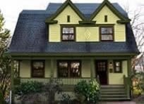
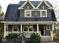
1910 Cottage

Before

After

Alternate colors.

101

77

87

103

207

1267

1277
The 1910 Victorian cottage looks very cheery. The color placement is a bit off. Notice the decoration in both gables. The trim color changes to red in an effort to say “look at me, I’m fancy.” It’s great having fancy features but they look better in a more reserved way as they do with the trim not switching colors. The red on the foundation and steps is too much bringing your eyes down to the bottom. The trim is white which doesn’t show up next to the pale yellow.
Scope of Work
- Correct color placement.
- Paint colors.
1900 Foursquare in the Snow

Before

After

Alternate color scheme.
Having yellow brick is not a problem like so many people feel it is. It actually goes with a lot of colors. The problem with the before colors is that they tried to match the trim to make it more yellow. The brown shingles work but they seem a bit too dark. Foursquares should however have a darker color on the 2nd floor and lighter on the 1st.
Scope of Work
- New paint colors to go with the yellow brick.
1910 Craftsman in Washington

Before

After

Alternate colors.
The house came to me looking drab, washed out. There was little contrast and the architecture was hardly noticeable. Among all that what they did do if you look carefully was to outline the window casings with maroon. Not a good place to accent.
What complicated matters when choosing colors is that the relatively new metal roof was a raspberry color. To tie in this roof meant that all the window sashes needed to be the same color.
Scope of Work
- Fix paint color placement.
- New Craftsman colors.
1889 Queen Anne in South Carolina

Before

After

Alternate colors.

Alternate colors.

Alternate colors.

Alternative colors.

Alternate colors.
I included a lot of renderings to show here because I had a hard time choosing. The previous homeowners neglected this house and now it will have a new life. Red roofing was extremely popular during the time.
Scope of Work
- Victorian paint colors.