


Exterior Paint Color Portfolio
The following is a small sample of the over 1600 projects. Click on the image to make it larger. I do not have a listing of the colors used in the projects below so there is a research fee. If you are interested in obtaining the color name and code for any of the samples, please email me with the Project ID listed below the project name along with Before, After, Alternate 1,2 etc. Please understand that the color calibration of your monitor affects the colors you see on your screen. There is a $20 research fee for the first color and $10 for each additional color payable through Pay Pal.
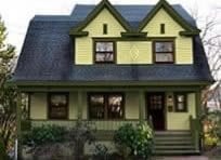
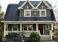
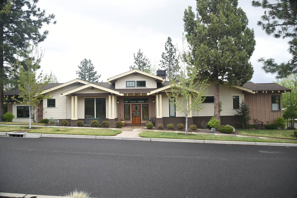
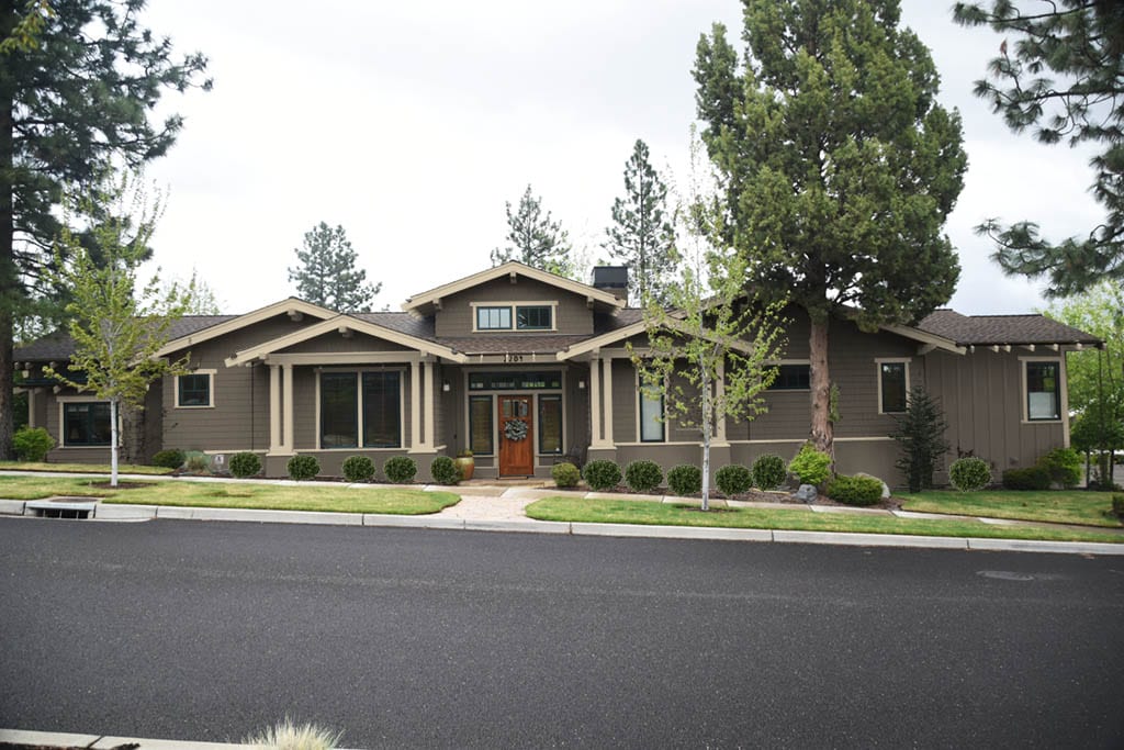
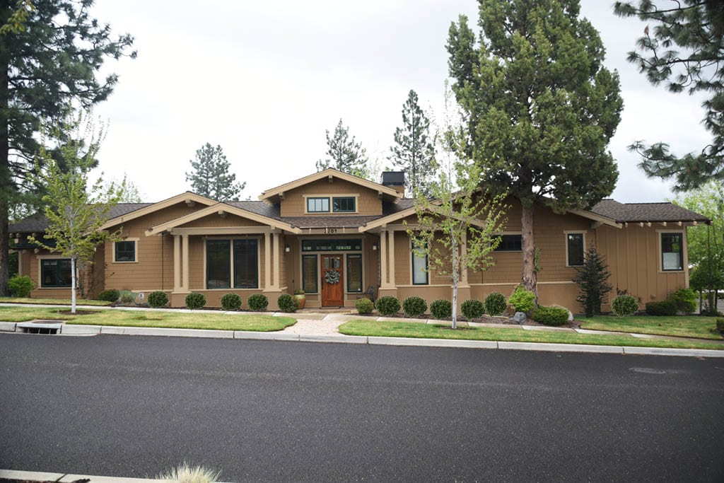
2008 Craftsman Revival gets major color correction
Before.
After.
Alternative paint colors.
Look closely at the before photo. This is a very long house. It is a private home. There is a lot going on in the design and the color placement is making it appear that the house is a group of individual businesses grouped together each with their own entrance. However, this is one home with one entrance but the super bad color placement confuses the viewer.
First there are different types of siding with different colors. All the siding needs to be one color. Also notice the trim. The trim and siding color are both the same color resulting in the lack of form and structure. Copper gutters break up the flow of the trim but that will not be changed. The body of the house must be one color only and the trim must have its own color that is contrasting from the body.
The house is low already being a one story dwelling. There is a stucco base to the house that is painted a dark contrasting color that reduces the height of the already low house. This area also looks like a foundation and a foundation should not stand out as a special feature of the house. Bad architect! This area gets painted the body color to appear like it is part of the house.
The result is still a poorly designed busy looking house but less perplexing to view.
Scope of Work
- Correct color placement
- Choose colors to coordinate with stone walkway.
1926 Florida Bungalow with tiled porch floor to match
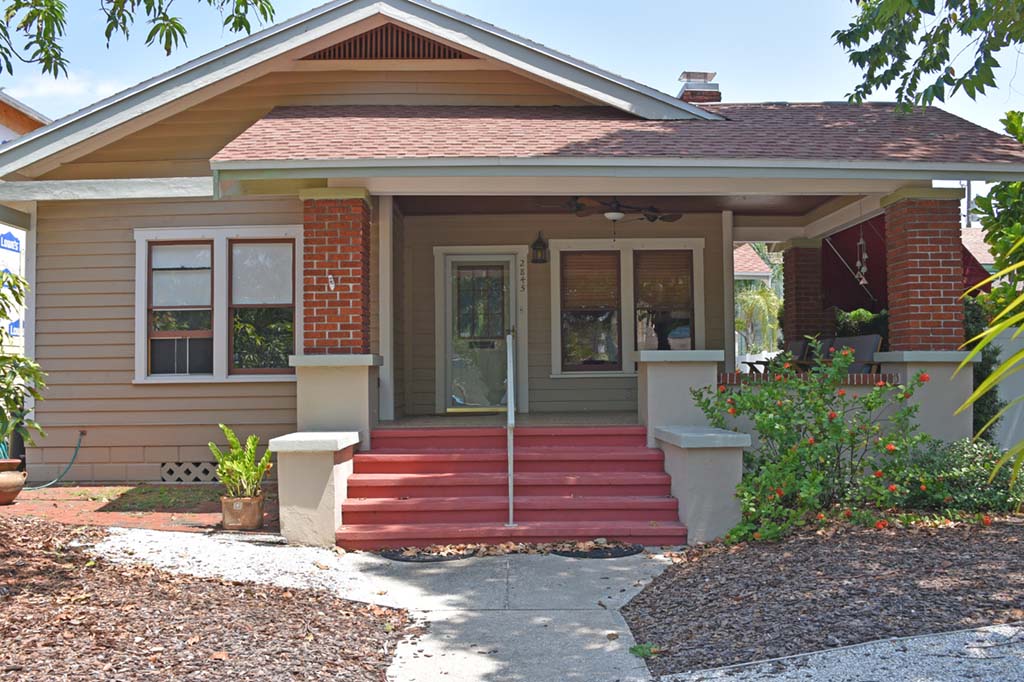
Before.
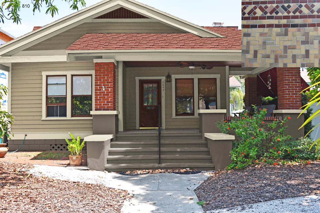
After.
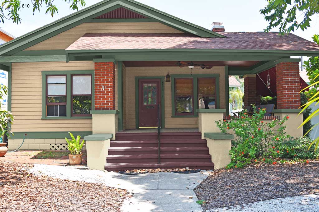
Alternative paint colors.
This Bungalow has a tiled floor as shown in the upper right hand corner of the after photo. Colors were chosen to match. This was very difficult because there were a lot of colors to consider. The brick was quite different than the tile. The dark purplish color in the tile was best to match the window sash while the darker gray color was used for the cement making sure that the tiled floor has some contrast next to the cement it is next to.
Scope of Work
- Historic paint colors to coordinate with tile.
1910 Yellow Brick Dutch Colonial
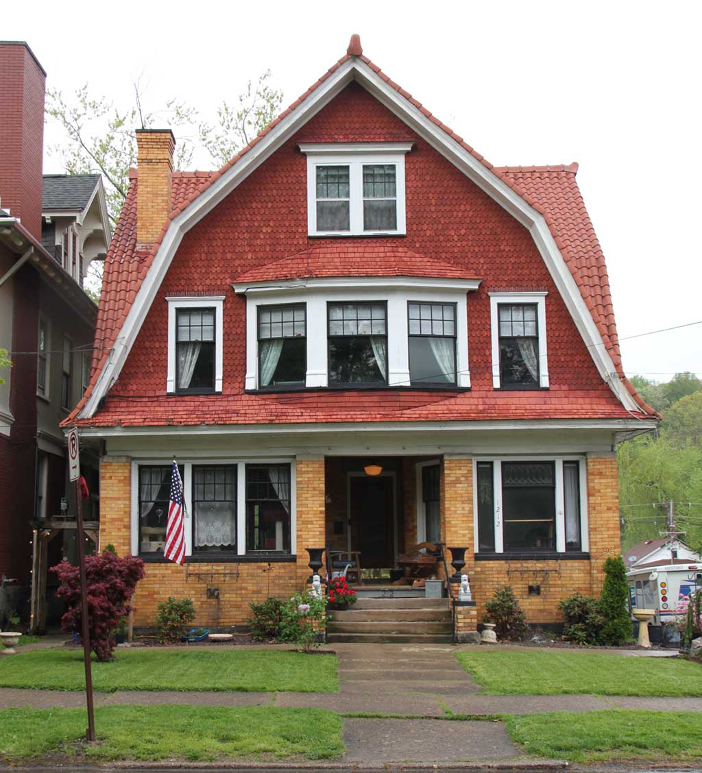
Before.
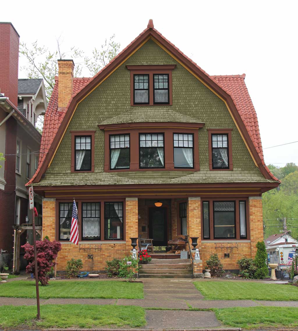
After.
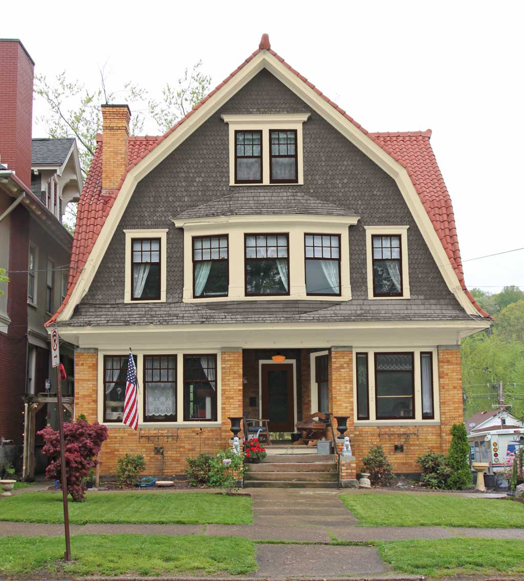
Alternative paint colors.
Do not mix reds. The terra cotta roof clashes with the red shingles.
Scope of Work
- Historic paint colors.
1870 Brick House in Saratoga Springs NY
Before.
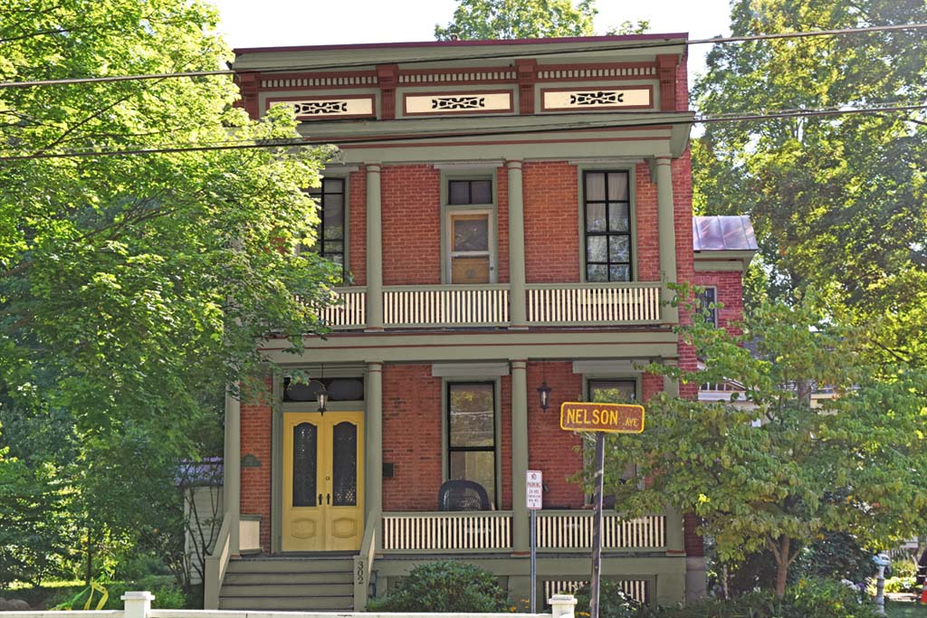
After.
The homeowner had already decided on paint colors during an earlier consultation so there aren’t alternate colors show.
Scope of Work
- Historic paint colors.
1880 Brick Moorish Revival Style Home
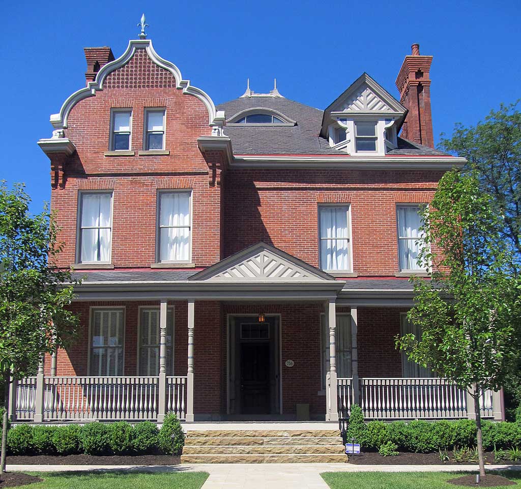
Before
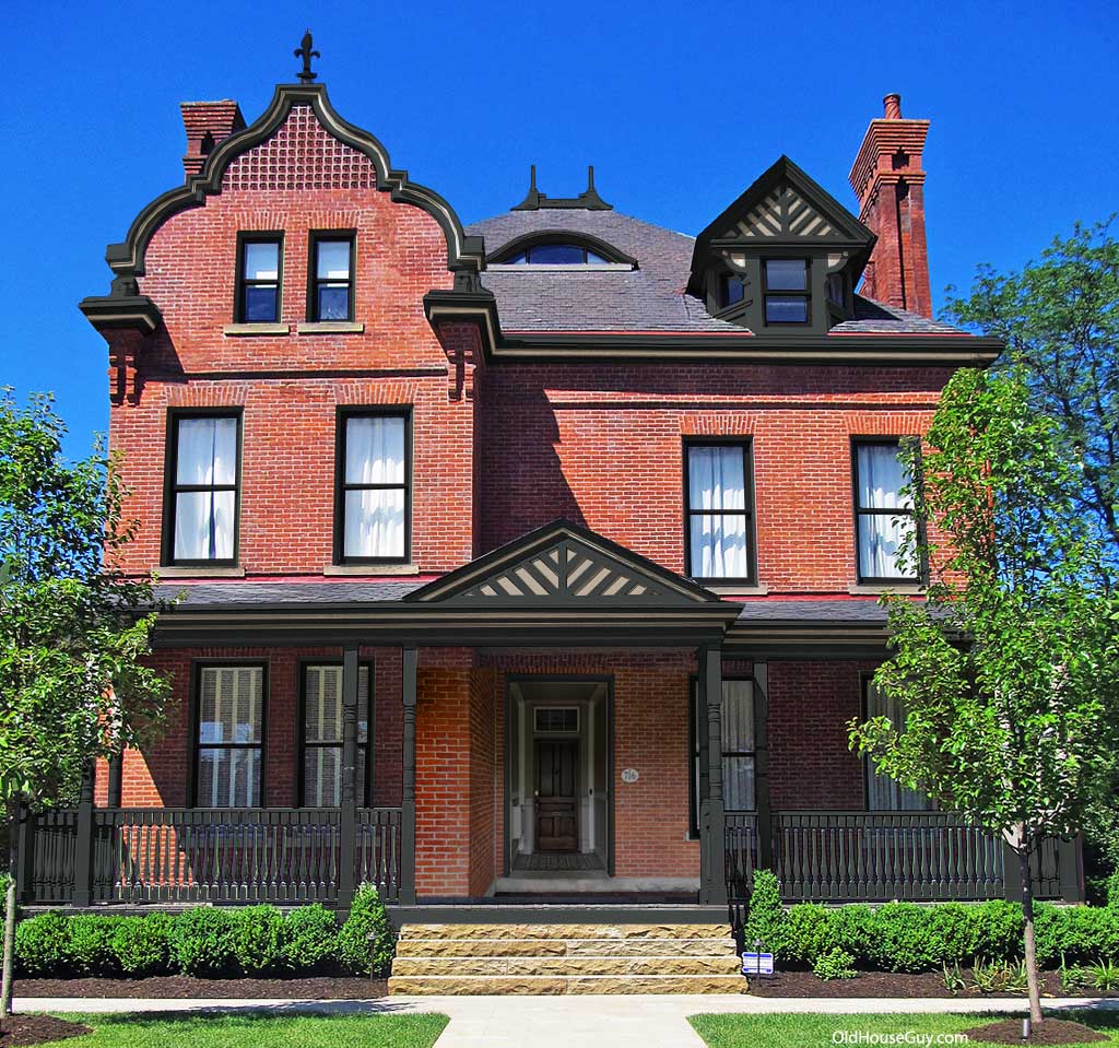
After.

Alternate colors.
Dark colors are by far the best for this house. The trim color the homeowner chose is almost black with a slight green hue. The window sash is plain black. The homeowner will be removing the balustrade that is way too tall.
Scope of Work
- Historic paint colors.