Exterior Paint Color Portfolio
The following is a small sample of the over 1600 projects. Click on the image to make it larger. I do not have a listing of the colors used in the projects below so there is a research fee. If you are interested in obtaining the color name and code for any of the samples, please email me with the Project ID listed below the project name along with Before, After, Alternate 1,2 etc. Please understand that the color calibration of your monitor affects the colors you see on your screen. There is a $20 research fee for the first color and $10 for each additional color payable through Pay Pal.
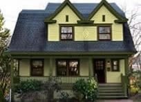
1900 Queen Anne in Wisconsin
In the before photo the colors were pretty bad. What was worse is how the painter painted the house. He/she only painted the face of the trim boards leaving the sides the body color. This really upset how not only the color but the architecture of the house was seen. The current balustrade is not the original style and the homeowner will take care of that.
Scope of Work:
- Correct color placement.
- Paint colors.
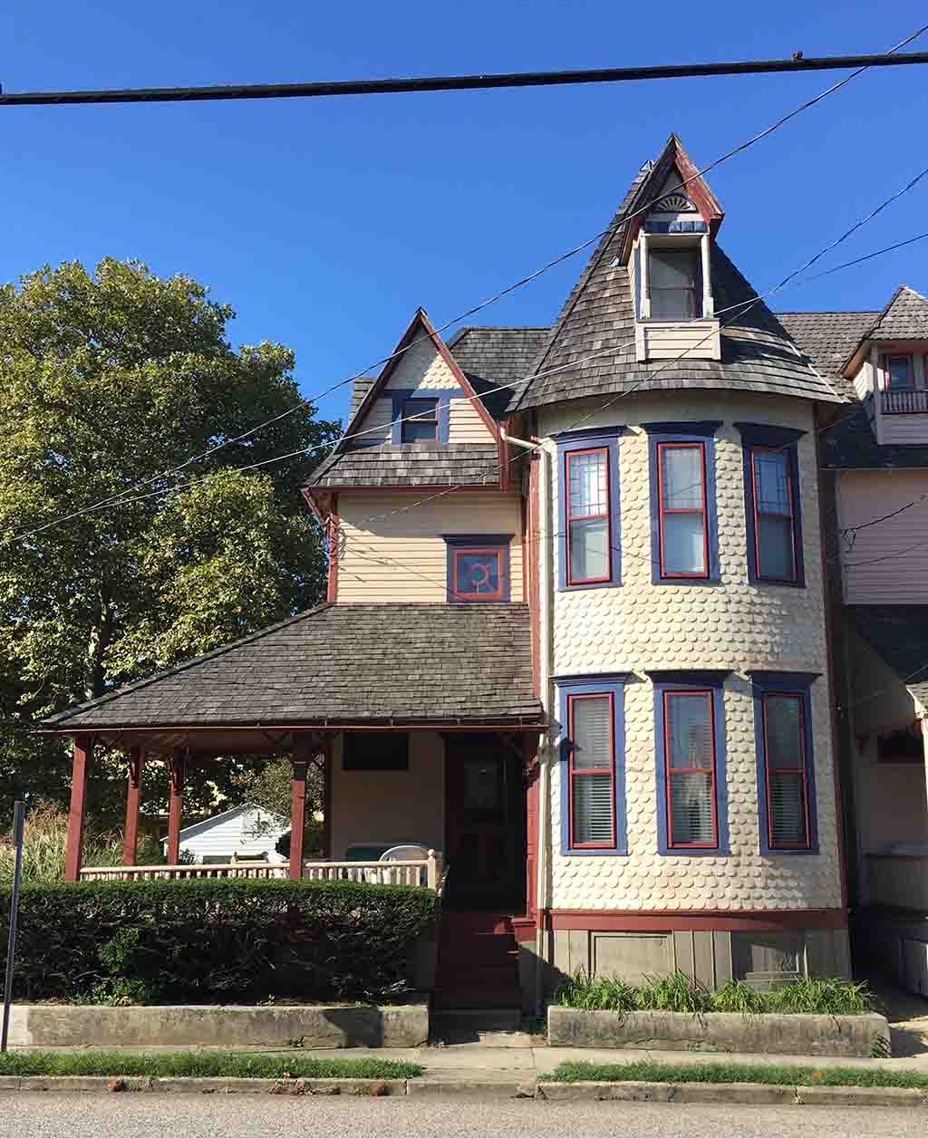
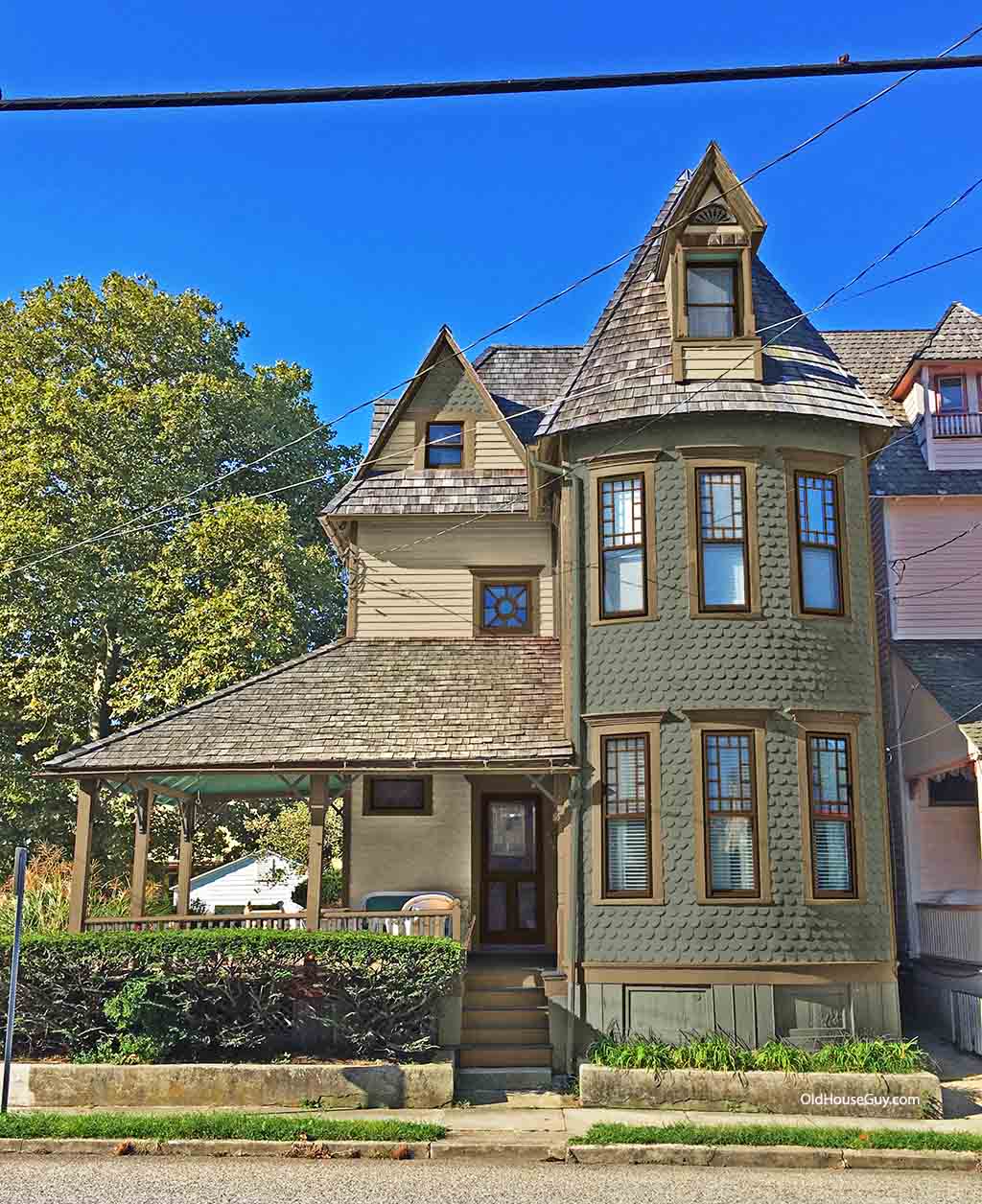
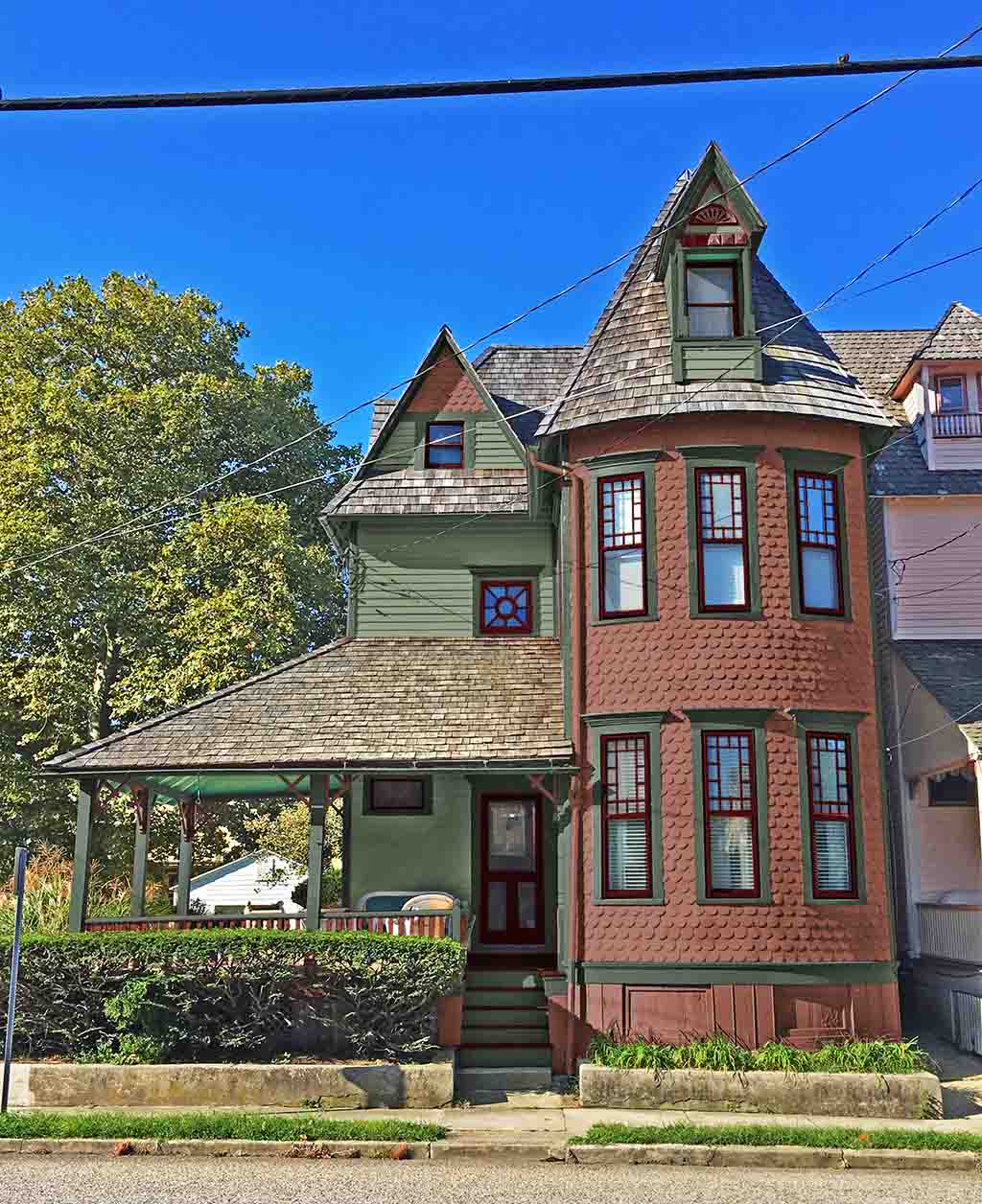
1884 Cape May Victorian
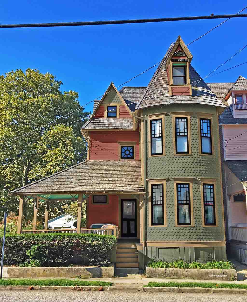
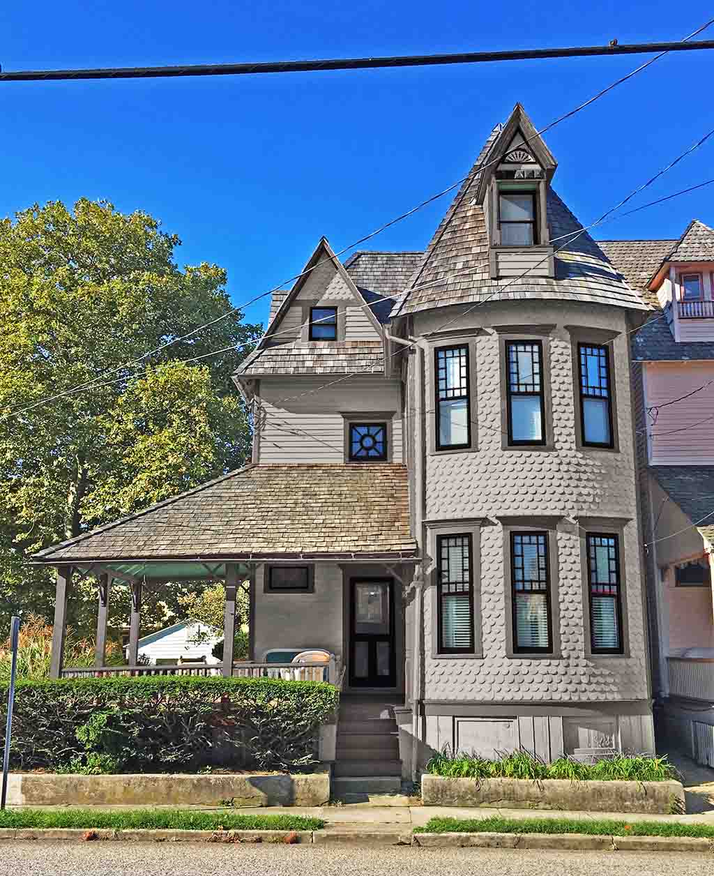
As you see in the before photo the color placement was all over the place. Cape May NJ is know for their beautiful Queen Anne Victorian homes painted in a fashion as the famous Painted Ladies of San Francisco. The Painted Lady trend began in San Francisco during the 1960’s when inexpensive run down Victorians were occupied by hippies. Using the flower power theme these homes were colorfully painted. Because of this painting these Victorians attracted attention and created a new interest to preserve these houses instead of knocking them down. Thank you hippies of San Francisco! These polychromatic bright colors are far from historical but look great on these houses. Cape May, a NJ beach community followed the Painted Lady trend.
Painted Ladies are extremely difficult to paint for there is a logic to the color placement and a huge understanding of architecture, structure, and proportion. Cape May has some very ornate homes but nothing comes close to that of San Francisco. SF houses have such an abundance of detailing that no matter how bad the color placement is, no one would ever be able to notice. Many people try to copy the SF colors and since they do not have the understanding of color placement and architecture most of them easily fail.
In this house, the previous owners attempted this look and the result was different colors in different places that made no sense. Other homeowners have consulted with local professional color experts and although the colors are nice the placement ruins the look. I also live in NJ and have visited Cape May many times. While I love the town I do not like most of the house painting. Taking good colors and placing them in the wrong places can ruin the architectural appearance of the house. The intent is good but the result is bad. Bad placement can make the house feel off balance and lack structure. These houses only look good when driving past but when standing in front of them they can create a confused feeling for the viewer cannot follow what is going on. The current owners knew the “feel” they wanted to express and we had an enjoyable experience working together very closely to accomplish this.
Scope of Work:
- Correct color placement.
- Paint colors.


