Can We Really Trust Builders and Architects?
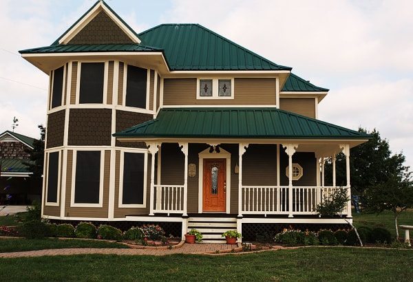
This contemporary Victorian design looks good to
the untrained eye but . . .
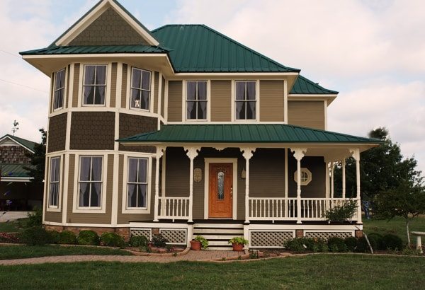
A Victorian Revival in need of help.
Contemporary Victorian design is quite popular today and admired by the untrained eye. But to the trained eye, as I hope yours will soon be, the results are a disaster. Before you scroll down, examine the house above and see if you can count the design errors and I will address this later.
I was contacted by the owner of this house for a house painting consultation.
The current colors work pretty well except for the natural cedar shingles that stand out and separate themselves from the house as if they don’t belong.
The color of the roof will limit the choices for selecting a new color scheme a bit, for the new colors must work well with the cool tone of the roof especially since the roof makes such a strong statement.
Yes – new paint colors can greatly improve curb appeal but the contemporary Victorian design of this house shows numerous architectural design errors. The homeowner however was only interested in a new color scheme.
Here are the new colors. This was the color scheme chosen by the homeowner.
The base color taupe, the shingles a darker taupe, the trim ivory, and the lattice the same taupe on the house but darkened. It all works very well together and also with the roof.
The project was completed and the homeowner satisfied but there is so much more that could still be done. Critical errors were made by the builder. Architects today do the same for they have no understanding about the traditional rules of design or even contemporary Victorian design.
Most problems with this house would never be noticed by the untrained eye, but they do make a difference and you will see how below.
Historic Victorian design or contemporary Victorian design does not matter. We are not trying to make a new home look historic. There are just basic building design issues here are wrong.
Look at the image above and see if you can find all the design errors. Does this house look right to you? If you can’t find them don’t worry – most homeowners would not notice most of them.
I counted at least 28 problems. Yes many are duplicates but look below at the red circles and notice if these areas do not sit well with you. Is there something that does not seem right to you? (besides red circles on a house) Below I will address each issue.
Roof gable problem:
Let’s first look at the gable over the bay windows. It looks like a hat that does not fit. The gabled roof is too small for the bay below it. It is just sitting on top of the roof like it does not belong. The ends of the gable should extend to the ends of the bay. The gabled roof needs to appear like it is serving the purpose of a roof and part of the entire structure – not an after-thought. You can compare the difference in the final image below later.
Porch roof problem:
Look at the porch roof. It is too steep and heavy looking. It’s pulled up so high it squeezes the 2nd floor. When looking at the 2 floor you would think you have to be a very short person to be in that room. Of course it is normal size, but your mind interprets it as out of balance with the rest of the house and gives you an unpleasant cramped in feeling.
Window problem:
What stands out most are the hollow looking windows. This house is located in Texas and I was told the windows have a sun blocking film on them. This film also hides the window sash. I removed this dark film in the picture because the appearance of the windows outweighs the benefit you get in protection from the sun.
When looking at a high quality image, you can see that the windows are actually six-over-one . This is great for a Colonial Revival or Bungalow, but NOT for contemporary Victorian design. To make this house look as good as it can I added new two-over-two true divided light wood windows – the type of window that should have been specified by the architect or builder if any of them had any brains. They just didn’t care to make the house look appealing.
The windows casings are picture framed – a big no-no. They also lack a window sill for water runoff. This I did not fix in the final image. To better understand the design of windows go here .
Foundation – Porch apron problem:
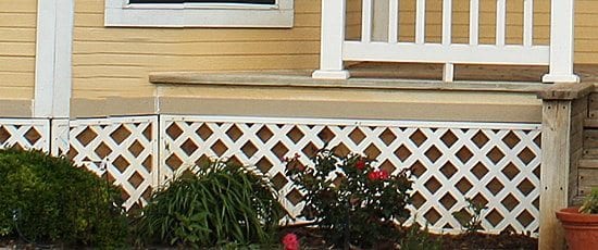
In the larger image above you can see that the plastic lattice was painted a dark taupe, similar to brown, to provide the appearance of a strong foundation for the house and make the plastic look less noticeable. Remember, the homeowner did not want to make additional changes. Today I would never take on such a project unless every issue was corrected.
One such error that most homeowners would not even notice is the area under the porch. Here the water table (horizontal trim acting as a transition from the clapboard to what should be the foundation) is currently painted a stone color when it should be painted the same color of the trim in order to show structure.
This water table trim then continues under the porch. The clapboard siding is also continued above this trim. This is wrong! There should be a fascia board under the porch floor instead. By painting both these areas the trim color, this design error is less noticeable. Compare the images below.
To better understand the porch and the importance of using lattice correctly, go to porch lattice and porch skirt info.
The original house had lattice under the porch AND under the bay. There is no foundation – no visible support. How can that plastic lattice support the bay and the posts that hold up that giant porch roof?
We all know that there has to be structure behind the lattice to support the largest part of the house. However our inner senses need to perceive a strong support .
As you see above and also below on the new corrected image I added brick under the full bay to show support and brick piers under each porch post. I also installed new lattice with frames.
There is still more. Look to the left of the porch where the railing ends. Why does the porch floor continue past the railing? It really looks stupid if you ask me.
Porch problems:
This is a contemporary Victorian design styled house. The type of decorative feature over the door is called a Broken Pediment. This is a very Colonial feature. Why did the architect add a broken pediment entrance so popular on Colonial Revival buildings on a Victorian? I removed this blunder on the corrected image. The Architect must have been absent this day in school.
Now look at the porch brackets attached to the posts. It seems like the two Victorian brackets in the center were left off for a better view of the ridiculous Colonial Revival entrance. You don’t do this! And if you order one too many brackets, return one, don’t tack it up anywhere like they did to the far left porch post just to avoid making a trip to the store!
Did you notice there are no windows on the porch? This is strange. The porthole window in its location is also strange. Although there are no windows, I still lowered the balustrade a bit so it does not appear to be cutting the porch in half.
The Front Porch Roof & Windows
The front porch roof really should not be visible from the street. Historically a porch roof was constructed of tin and over the years when the roof failed instead of repair it was replaced. When the roofs were replaced the pitch was much steeper – much more steep than it should be.
In this example, the porch roof is so steep and high it squashes the second floor. The second floor appears like a crawl space for little people when it should appear as living space.
The two small windows are out of place. If for a bathroom, use windows that match or move the bathroom someplace else!
To fix this problem, I lowered the slope of the porch roof and added two matching windows. The second floor is no longer choking.
Here is the final image with the corrections.
Here they are side by side to better compare.
Look at the two images above and notice the corrections
- Porch roof slope lowered.
- Matching windows replace the out-of-place windows.
- Window sash with Irish lace curtains installed.
- Gable over bay enlarged to fit house.
- Colonial revival broken pediment over door removed.
- Two brackets added to posts at entrance.
- One bracket removed from post at far left.
- Railing height lowered.
- Brick pier supports added under each post.
- Brick foundation added under bay.
- Wood lattice and frames installed.
Additional improvements: The windows are missing window sills and should be added. Landscaping is also recommended.
All these items above may seem insignificant but each feature needs to work off the other and create a feeling of harmony and balance. We may not realize it but our inner senses do. To better understand aesthetics click here.
If the changes above were made to this house it would have much better curb appeal. Landscaping would give it the finishing touch it needs. If I were designing this house there are still many things I would not do, but this is what there is to work with.
Sadly someone paid big bucks for this bad design.
Don’t let this happen to you!
For help with your home, please read our Services page and contact me for a consultation so you can avoid mistakes such as these. Most builders and homeowners are not aware of things like this.









What an excellent blog post. I always appreciate your thoroughness – no drive-by education from you!
Mistakes are so often made that compromise the architectural integrity of our built history that we actually developed our first Preservation Primer to help homeowners think about the complexity of historic restoration on their home.
It’s a subject we explore often on our blog and in our newsletters too. The best way to combat a lack of awareness is education!
I’ll definitely be re-posting this blog post for you as a way of getting the word out about this terribly important topic.
Great article! Thanks for sharing and more power to you!
Details, Details, Details! God is in the details! What a wonderful & detailed article & a refreshing recourse. I really enjoyed your article. I would also like to see articles & photos referencing brick veneer & stone exterior finishes with shutter, etc. for various architectural periods. Thank you again for the enjoyable & refreshing article.
Fantastic post. So helpful…it’s one thing to know that a house looks wrong; it’s another thing to be able to pinpoint exactly why.
A question: what are your thoughts on the hipped roof? At least in this part of the country, I’ve never seen a hipped roof on a Victorian farmhouse before.
Thanks! There are hipped roofs on Queen Ann Victorians but you’re correct – I can’t recall it on a farmhouse Victorian.
Thanks for the information….truly informative:) I have a home that was built 1921 and it has asphalt siding, not sure when it was installed. But there are places where the siding is coming off and since they no longer sell asphalt siding. Do you have any suggestions on what I can replace it with.
Don’t see many houses with asphalt siding anymore. Best to remove it all.
I have asphalt siding on the back of my barn (installed by previous owners). It is absolutely disgusting. It is in the pattern of fake bricks but in a terrible brown color.
It matches nothing else on the main brick part of the house (from approx 1850). It matches nothing on the older wood part of the house and barn (seems to be early 1800’s).
I will remove it and put wood up… perhaps board and batten style. This is what is on the back of my neighbor’s barn, as well as some others in the area, despite clapboard on the sides. Is this normal? It seems to be around here, because this combo is present on a lot of old structures. The clapboard is painted, but the back of the barns seems to be left natural.
The price of wood was high this last summer, and I had too many other projects, so I hope to do it next year.That should be pretty easy.
I think the previous owner was asking what to replace their asphalt siding with once they remove it.
Vinyl siding, right?
And white vinyl windows that match nothing else on the house.
Ken loves that.
Hahahahaha.
Hey there – yes follow the local examples. The back was not painted to avoid the extra work and money but I would paint it to protect it. Good luck!
I meant to type “previous poster” was asking what to put on their house if they took the asphalt off.
I like the changes but suggest window sills. The main roof should peak like the gable. These are not the best victorian colors for this house…there should be more colors.
Yes – window sills. No there should not be more colors.