


Accenting Victorian house colors is a good way to show off and allow viewers to appreciate the details and craftsmanship of Victorian architecture.
The problem is that almost everyone agrees with this and tends to go overboard when painting their home.
There are interesting architectural details that may seem Victorian to some people on all styles of architecture – even Ranch houses.

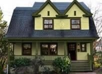
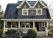
Victorian features accented in color.
Accenting Victorian house colors does not mean that every feature on every style home should be accented. You can’t turn every home with nice features into a Victorian or to take it to an extreme like a painted lady. At least you shouldn’t.
In my business I get requests for this everyday.
When accenting Victorian paint colors there are some common color placement errors I would like to point out.
Window Headers
One common blunder is accenting the crown of a window header.

Window casing with crown on window header.
Here we have two windows. Notice the window on the left has a nice wide window casing with a crown on the top. Notice the shape of the casing against the dark green siding and how the casing veers up at the top looking decorative.
This window casing is viewed as a single unit that is ornate in shape because it is not just rectangular. The crown at the top adds lots of appeal.
Now look at the window on the right. The crown is accented but really it is “painted out”. The crown no longer part of the casing for it is a different color. The casing is no longer ornate but merely just a rectangular trim. The head casing (top) also looks small now.
By accenting Victorian paint colors and trying to be fancy, the window instead became plain.
Painting the Handrail
Many homeowners believe they can make their house look fancier or more Victorian by accenting Victorian house colors on the handrail of their balustrade.
This is a very common mistake.

Accenting Victorian house colors with a red handrail.
Porches are shaded and a accented (especially in a darker color) handrail makes part of the handrail disappear.
One of the qualities of a well designed balustrade is to have a hand and foot rail that are thick when viewed facing the house. Click here for more porch railing design information . If you have a white hand rail and paint part of it a darker color, the result is a skinny looking handrail. You only see what is painted white as being part of the porch handrail.

Notice the nice thick handrail.
When painted all one color notice how thick and strong the porch handrail appears.
Accenting Spandrels
Spandrels are a decorative feature like a small balustrade located under the porch beam.

Spandrels are wrongly accented.
Here again the homeowner loves their ornamentation and wants to show it off. Instead they made it disappear.

Spandrels are visible.
See how less is more?
Accenting Victorian House Colors Exceptions
Yes there are exceptions and that is mostly case by case. In the above examples the houses have a darker body color and a light or white trim color. The exception is when the light and dark are reversed. When your trim is a dark color and the body of the house a light color. Accenting Victorian house colors with a color that is similar in light reflectance value will not visually change the architecture of the house.
An example might be a house with a light tan body color. Paint the balustrade a dark green and the handrail a dark red.
Here is a good example of the house above.

Nicely accented spandrels. When the trim is a dark color the accent brightens it up and makes it more noticeable.
So if you have nice features on your house, admire them and think twice about accenting them. They may be just a small piece of a large picture but they can have a positive or negative impact. If you’re still not sure about accenting Victorian colors, Old House Guy offers a virtual house painting service to help you with.
I love what you’ve done with painting there! Although the whole property could use a good amount of maintenance and repairs, for what I can see from here decent painting has really refreshed the whole exterior, congrats.
I have a massive paint catalog from 1887. The paint company text states that the practice in San Francisco of picking out every architectural detail in a different color is an ‘abortion of good taste.’ So there is some historical precedent for this practice on the West Coast.
That’s true! The San Fran painted ladies was merely a hippie culture moving in on some then cheap housing. This shed a spotlight on these homes making people appreciate Victorian architecture once again. San Francisco is therefore known for it’s painted ladies and I would recommend painting this way if you’re in San Fran but not in other places.The multitude of colors may look pretty and very impressive but results in a confused feeling of form and balance of architecture. Of course, some houses are done better than other.
Wow I just love this style of home and its nice to see so much effort going into the preservation of them. Were the photos of the last example (spandrels) taken over a period of years? I love the transformation of the house although I think the posts would look better in solid brown to match the frame of the house.
Nice look! I can’t believe what a difference it makes!
Very informative
Is there a “just off white” white paint that you enjoy working with the most? one that has real depth to the color, but not too bright (BM Simply White is too bright for me), something a bit warm that won’t throw off a bunch of undertones?
for either an all-white house paint, or for trim and porch railing.
thanks!
I like Benjamin Moore Navajo White and Sherwin Williams Classical White 2829
The comments about painted ladies are really interesting. I saw very few of them in San Francisco, even though the houses were Victorian. But since I am making a Victorian dollhouse village, I have painted each of them a different color, just for fun, with lots of colored trim. Now I will have to rethink this. I read your column every month, and try to make my houses as accurate as I can. I did give up on adding the gutters and downspouts, and I’m still working on how to make a simplified version of the furnace you sent me pictures of.
Wow – sounds like a fun project. Nice to duplicate history without the huge expense.
Thanks for all this great information. I’m confused by your comment about the exception to the rule on houses with light bodies and darker trim. For example, if a house had a light body with darker trim/railings is that a case where the spindles could be accented in a 3rd color as dark or even darken than the trim or would you only want to stick with either the body color or trim color on the spindles in this case?
Reading back through your description of the exceptions I see you mention in these cases the colors on the rails and balusters should have a similar LRV. So I’m assuming you’d advise sticking to that rule if the porch balusters were to be painted a color other than the primary body or trim/railing color. I have the Moss and Winkler book; they emphasize painting the balusters the same as the principle body color and don’t really mention any other possibilities so I’m just trying to better understand the options. I’m going to be getting my trim and porch repainted soon but not the body, and I suppose the safest bet is just to continue the trim color onto the balusters in order to avoid a bad color match to the body. I have also been considering the possibility of a different color for the balusters which is why your mention of exceptions caught my attention but maybe it’s not worth risk of ending up with an accent color that could create a less than ideal effect.
no different color
Hi – On a house with a dark trim and light body it would be best to repeat the body color on the individual balusters/spindles.
Keep the colors to a minimum by reusing colors. For accents re-use the window sash color or/and body color. If you have panels, the recessed part should be the body color. If you want more then the edge/trim surrounding the panels should be the sash color. I would not do the spindles in a dark sash color or a different color. Keep them the trim or accent them with the body color. This creates the best harmony and balance avoiding any heavy or strong areas.
Thanks for your thoughtful response. We have decided to stick to the trim color for both the railings and spindles. It would be to hard to get a good match to the body since we are not painting it so of the two options you recommend for the spindles just sticking with the trim color is the way to go. So basically we are keeping things simple. One dark color for the sashes and shutters, a medium color for all the trim, and for now leaving the body it’s current light color. Thanks again.
I stripped off all the paint on the box bay window unit and am following your advice to paint the inset panel under the windows, the main body color of the house. Then paint the trim around the inset panel the window sash color. There are three windows across the front of and one on each side of the boxbay window unit.
Where I am stuck is , what colors go on the body of the box bay window area around the inset panels? Then the area above, below and beside the windows themselves? I’m guessing the house trim color would be continue on the trim of the
windows and the trim along the bottom of the boxbay window unit itself.
What color would the diamond cut decorative area above the windows but below the roof and roof trim be?
I haven’t seen any of your consulting work involve that type of boxbay window unit.
I did the same type of boxbay window unit on the left side of the house in the 19th century photo of the 1875 Kentucky Victorian in which you consulted on. There is only a picture of the front of the house with the paint color changes you implemented so I couldn’t get an idea about the left side changes that you made.
Thank you for the education you provide your readers. I also thank you if you have the time to consider answering my question.
Hi Susan – it is difficult to understand from reading and unfortunately you cannot upload a photo. Email me at the contact us a photo and I will get back to you.
I’m having trouble deciding which color to paint the porch of my 1895 Queen Ann.
I’m of a different opinion, I believe that the details are better seen when they are not painted in different colors. I painted my whole house a beautiful custom white. I’m mimicking the Hotel Del Coronado color scheme, but they put in new wood for their decks. I can’t afford that, so I need to pick a paint color. Any suggestions?
Never a stained/varnished porch floor. When you say porch I’m not sure if you mean the floor or the porch itself. The porch – railing etc should be the trim color. If the porch floor, most people use gray, but that is a cool color, so it may clash with most house colors. With a white house, it will work great. Am I understanding your quesetion correctly?